
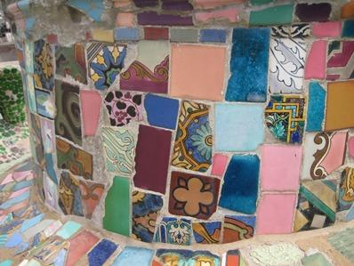
The iconic view of the Watts Towers shows the massive spirals silhouetted against the sky, emphasizing the magnitude of Simon Rodia’s artistic and engineering marvel. What’s missing from this image, however, is the exuberant color of Rodia’s mosaics, which line the walls, archways, and even the towers themselves.

Watts Towers, detail

Watts Towers, detail
Many of the fragments that make up these vibrant designs come from local pottery manufacturers, whose solid-color dinnerware inspired a national craze in the 1930s. The trend started in Southern California, where companies like Brayton Laguna and Catalina Pottery began producing vivid colored earthenware in late 1920s and early 1930s.
")
Detail of the Watts Towers showing Metlox mark
")
Detail of the Watts Towers showing Vernon Kilns mark

Daniel Gale Turnbull for Vernon Kilns. Ultra California coffee pot, c.1937, LACMA, Decorative Arts and Design Acquisition Fund and partial gift of Bill Stern
Larger companies, such as J. A. Bauer Pottery Company, Vernon Kilns, Metlox Manufacturing Company, Gladding, McBean & Company, and Pacific Clay Products began to produce their own versions, marketing them across the country. Brand names like Metlox’s Poppytrail (visible in the plate above) and Gladding’s Franciscan traded on romantic images of California’s beauty. Their success spurred Eastern and Midwestern potteries to launch imitations—most famously the Fiesta line, introduced by West Virginia’s Homer Laughlin China Company in 1936. The California Pottery Guild, founded as a joint advertising venture by the five major Los Angeles-area producers, worked to remind retailers that the fashion for “California color” had originated in the Golden State.
")
Watts Towers, detail
")
Watts Towers, detail

Louis Ipsen and Victor F. Houser for J. A. Bauer Pottery Company. Stacking storage dishes, c. 1932, Decorative Arts and Design Acquisition Fund and partial gift of Bill Stern
The heyday of California pottery overlaps with Rodia’s construction of the towers (1921–1955), so it’s no surprise that fragments of the characteristic colors and deco-style lines of their products, which would have been inexpensive and plentiful, pop up so frequently in his work. The bright ridges in the archway above may very well have come from a set of Bauer stacking dishes, like this example from LACMA’s collection. While the towers as a whole demonstrate the powerful vision of one man, the individual pieces give us a glimpse of the material world that surrounded him. The exhibition California Design, 1935–1960: “Living in a Modern Way,” which opens in October, will take a broader look at this world, including the designers behind the colorful pottery that was so appealing to Rodia and his contemporaries.
Staci Steinberger, Curatorial Assistant, Decorative Arts and Design