Though often overlooked in graphic design curricula, Claes Oldenburg’s work with the alphabet and letterforms is worthy of greater investigation. Best known to designers for his oversized, humorous everyday objects, Oldenburg has infused observation and imagination with letters, characters, and typography since the late 1950s. An eye-catching example of his ingenuity of morphing word into image is Untitled [City as Alphabet], from the Notes portfolio printed at Gemini G.E.L. in 1968 (recently on view in The Serial Impulse at Gemini G.E.L.) In addition to his type-focused drawings, prints, and sculptures, he’s designed an abundance of rich and intriguing announcements and invitations promoting his exhibitions and performances. Like many of his public monumental projects, his work around the alphabet and letters prompts us to see typography in playful, uncommon, and energizing ways.
Given Oldenburg’s expansive body of work, tracking down ephemera and out-of-print exhibition catalogues and scouring museums’ online collections are the best ways for present-day designers, typophiles, and Oldenburg connoisseurs to unearth and appreciate his lively, thoughtful “characters.” Here’s a selection of my personal favorites:

One color offset lithograph promoting the exhibition
New Media—New Forms in Painting and Sculpture held at the Martha Jackson Gallery in 1960. The overall image is mysterious; names of artists represented in the show seem to be contained in an object which can be perceived as a headdress, foot, or phallus. The poster's crude look matches other handmade Oldenburg work of that time, like his 1962 etching
Orpheum Sign. Art © Claes Oldenburg

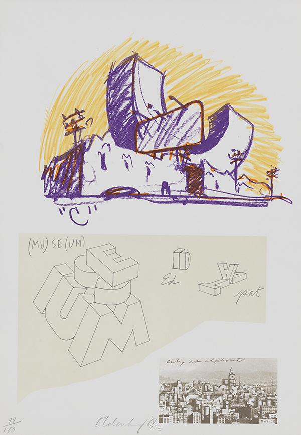
Gemini G.E.L.'s 1968 miniature facsimile announcing Oldenburg's Notes portfolio. With text by Barbara Rose and Oldenburg, it contains each of the 12 works from Notes as loose plates. Art © Claes Oldenburg
. The poster also features Oldenburg's stunning 1965 Soft Juicit. The British type company the Foundry later collaborated with Crouwel to develop digital Catalogue fonts based off the original lettering.")
Above and below: Exhibition catalogue and poster designed by Wim Crouwel for an exhibition of Oldenburg's work at the Stedelijk Museum in 1970 (poster shown from the same show traveling to Germany later that year). The poster also features Oldenburg's stunning 1965
Soft Juicit. The British type company the Foundry later collaborated with Crouwel to develop
digital Catalogue fonts based off the original lettering.

Art © Claes Oldenburg
My obsession with Claes Oldenburg’s typographic-based work stems from the Stedelijk museum’s 1970 catalogue [Claes Oldenburg] designed by Wim Crouwel. Crouwel’s straightforward cover displays the artist’s name and embossed initials of the museum through lettering that visually co-opts Oldenburg’s iconic soft objects. The “padded letters” are simply built on an elementary three-by-three unit grid, slightly altered for the ascenders, descenders, and the letter “m,” and employ an inner rounded corner to imply Oldenburg’s soft work. Crouwel later remarked, in Kees Broos’s Wim Crouwel Alphabets, about his experience of working on the project: “When the catalogue was finished and Claes saw it, he asked me if I would do the whole alphabet, so I did…. Then he sent me a lovely drawing, of his ice-cream alphabet, with the dripping letters.”

A quick animation illustrating Oldenburg’s work, process, and details on the history of the
Alphabet/Good Humor Bar, exhibited in
Claes Oldenburg: The Alphabet in L.A.; published by Margo Leavin Gallery in 1975. You can view images from the exhibition from the Margo Leavin Gallery
here. Art © Claes Oldenburg
. The catalogue design is credited to Judith Schwartz. Art © Claes Oldenburg")
Published by the Akron Art institute in 1977, this animation again features Oldenburg’s rich process, influences, and experiments for his inverted Q project. This comprehensive undersized catalogue tells the story of the artist being invited to Akron, Ohio by the passionate art patrons Louis and Mary Myers to create a sculpture for the Akron Public Library garden. The commission led Oldenburg to create an edition of four six-foot-tall sculptures of the inverted Q out of painted concrete and two 18-inch versions of the inverted Q in rubber and plastic (each was cast in editions of 12, plus an artist proof). The catalogue design is credited to Judith Schwartz. Art © Claes Oldenburg
 and Autobodys (1963), feature intentional misprints as typographic cheekiness, again demonstrating Oldenburg’s wit. Both advertisements reference a visual vocabulary of late 19th century handbills where letters and text were often mixed and combined with letterforms of shifting scale, width, and ornament. Art © Claes Oldenburg")
Above and below: While misspellings are usually identified as grammatical errors, these two letterpressed posters, The Store(1961) and Autobodys (1963), feature intentional misprints as typographic cheekiness, again demonstrating Oldenburg’s wit. Both advertisements reference a visual vocabulary of late 19th century handbills where letters and text were often mixed and combined with letterforms of shifting scale, width, and ornament. Art © Claes Oldenburg

Art © Claes Oldenburg
Check out Oldenburg’s soft sculpture Typewriter Eraser in the modern art galleries.
*