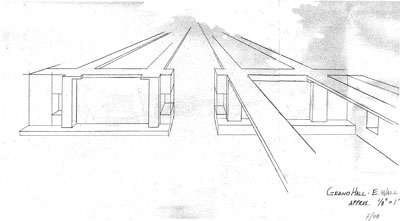
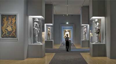
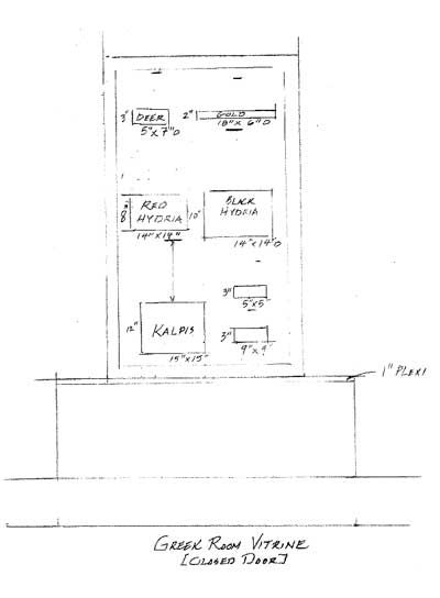
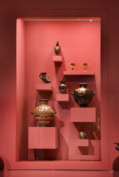
When I heard that designer David Hundley (who is perhaps best known for his line of Gucci dog products, but has also worked for the likes of Ralph Lauren and Lexus) would be designing the installation for Hearst the Collector, I was curious to see how he would blend his minimalist aesthetic with Hearst's maximalist credo. Here, David explains how he managed to meld parts of both, and kindly shares his sketches for a little "before and after."
What was your inspiration for the Hearst installation design?
The sheer scale of Hearst Castle reduced to a minimalist state. In other words, Julia Morgan's designs without the ornamentation.
Stripping the ornamentation seems almost antithetical to Hearst's own aesthetic, but the installation design, as minimalist as it is, still seems to evoke opulence.
It was very exciting to take the grand and ornamental and retain the grand but strip away the ornamental, which, on reflection, has been a hallmark of my designs.
What were some of your basic design strategies?
I started with an empty 22,000 square foot gallery consisting of four rooms. I created three grand halls from the largest gallery, having walls built to the ceiling. These are vertical to the two horizontal Wilshire galleries. I squared off the angular parts of the building providing storage rooms for crates and other packing. Within the newly built walls are recesses to frame the tapestries and niches for many of the smaller sculptures. Vitrines and cases were built to house many of the smaller objects.
Did you take into account how Hearst might have wanted his objects displayed?
"From Hearst's point of view, museum quality status was obviously a prime concern. Impact and impression were his most evident goals in decorating; if desired effect was achieved, breathtaking juxtapositions were achieved." I jotted this quote down while perusing a Hearst Castle catalog at the Senator's House on the Hearst Ranch. It stuck with me as I designed the exhibit.
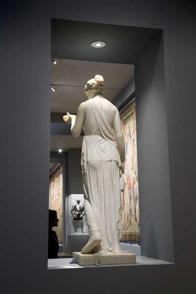
One of my favorite spots is behind the cutout that houses the Thorvaldsen statue. From this vantage point, visitors almost become a part of the artwork—they're actually framed.
The placement of the Thorvaldsen statue as the focal point at the end of the grand central hallway was one of my initial ideas, and the entire design evolved from this gallery. The curator from the Thorvaldsen Museum in Copenhagen, who accompanied the statue to Los Angeles, paid us an enormous compliment. She said she had never seen the statue so beautifully displayed.
I also thought the elaborate table lamp on the Lucite-topped pedestal in an ultra-stark room was pretty great.
The Tiffany Lamp is so "over-the-top," that I had to come up with the thick plexiglass-topped oversized stand to highlight how far over it is.
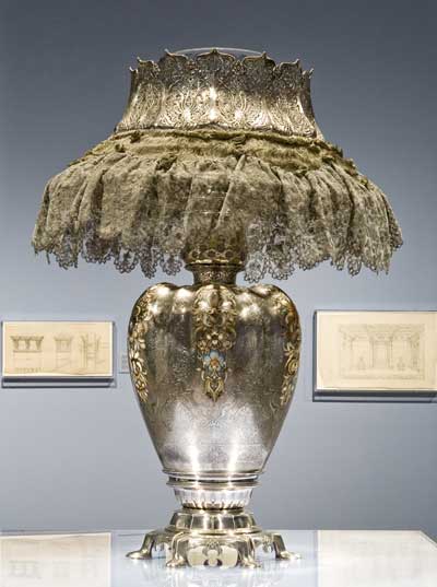
(Edward C. Moore) Tiffany & Co., "Orchid Vase" Lamp, Hearst Castle® / California State Parks, photography by Victoria Garagliano, © Hearst Castle®, CA State Parks
What elements of your design are you the most excited by?
I am most excited about the grandeur I was able to achieve by the scale of the hallways and the placement of works of art somewhat higher than is traditional.
Now that you've been so immersed in the subject, will we be seeing any Hearst-inspired designs coming from you in the future? What else are you working on?
There is a very strong possibility that my future designs could be influenced by my exposure to the Hearst collection. I am currently working on a residential design project, and I have been asked to design for the oldest glass factory in Venice, Italy, which is celebrating it's 150th anniversary in 2009.


