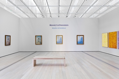
Claude Monet painted thirty different depictions of the Rouen Cathedrals between 1892 and 1894, ostensibly creating the concept of seriality in art. He intended the paintings to be shown as a group, and the repetition (and the nuance) emphasizes the artist’s hand. Certainly that is apparent when you take in the five Rouen Cathedral paintings on view now (two of which, from the Museé d’Orsay, have never been on view in the U.S. before). The impact of seeing them together is powerful. Funny, then, that the longer I stayed, the more I wondered—which one did I like best?

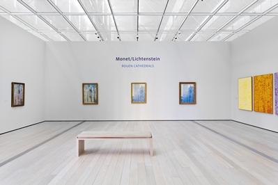
Installation view of "Monet/Lichtenstein: Rouen Cathedrals"
Something about this exercise felt wrong. Monet is one of the greatest artists of all time, and his Rouen Cathedrals are among his best-loved. How can you choose? Then again, are you even supposed to choose? If the paintings are meant as a series, is it meaningful to choose one over the others? Well, yes—it’s meaningful because it’s personal. The longer I looked at the paintings, the more invested in their nuances I became… and the more I began to consider my own peccadillos.
The first painting, simply titled Rouen Cathedral, Façade (1894), seemed to me the most rugged. All of Monet’s paintings have a textural quality to them, but to me it was most palpable here. The third painting, Rouen Cathedral, Portal and Tour Saint-Roman, Full Sun, is the starkest. The pure blue of the sky, the pale yellow façade, absent of the blues, purples, and oranges of the other paintings depicting the building in the early morning hours.
But it’s number four, Rouen Cathedral, the Portal and Tour Saint-Romain, Morning Effect (1893), that I like most.

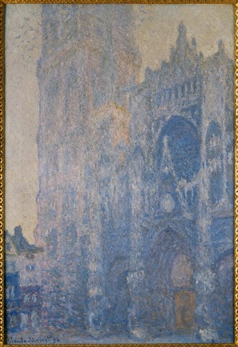
Claude Monet, Rouen Cathedral, the Portal and Tour Saint-Romain, 1893, Museé d’Orsay, Paris, France (Inv. RF2001), photo courtesy Réunion des Musées Nationaux by Thierry Le Mage/Art Resource, NY
Nothing against the other paintings, but it’s settled. Why? What distinguished it in my mind? Perhaps it’s that there are signs of life—a flock of birds clustered around the tower, just taken flight. On my first pass around the gallery I was looking up close, reflexively feeling that if the difference is in the details, one must get close. The top left corner looked to be smudged—I processed it as an error. Why would Monet place these erratic, dark divots in the sky? Only backing away did they reveal themselves to be birds. I sat on the bench in the gallery, about ten or twelve feet away, and stared longer. It was then my eyes went to the portal, detecting the orange of illumination from within—a detail that is absent from the Full Sun painting, and less clear amidst the sunlit glow of the other early morning paintings. The contrast between indoors and out was highest here. Someone was inside. The building was breathing.
Playing favorites among the parts at expense of the sum is arguably a fool’s game. Nevertheless, there it was. “That’s the one I’d take home,” I thought to myself. Perhaps I liked this one best because, frankly, I’d spent the most time looking at it. The birds hooked me; I found a toehold in the painting, something that asked me to make sense of it—to discover its beauty rather than to passively accept that it was beautiful. I looked twice.
And then: “That’s the one I’d take home.” The words I’d just thought to myself were suddenly spoken aloud by a man not two feet away from me, speaking to his wife. I glanced over and caught him pointing to the Full Sun painting—my least favorite! Apparently the question I’d been wrestling with was not uncommon. I listened as he went on about the painting. Then he turned his eyes to the others and started to speak of their differences. “That one is also really great,” he said of another. “Those are the two best.” The more he considered his options, the more difficult it became. Standing before the paintings, he finally summed it up:
“If I could only take two home… I’d take three.”
Me too. Maybe five.
Scott Tennent


