

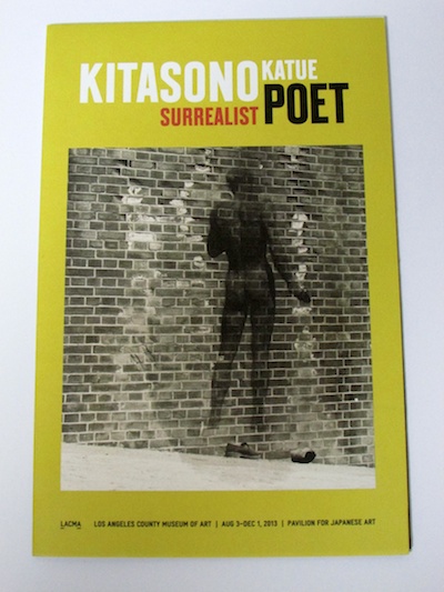
During my two-week visit to L.A. in October, I had several opportunities to visit the Pavilion for Japanese Art at LACMA to see the exhibition Kitasono Katue: Surrealist Poet. What first struck me was the installation and presentation of the works of art in the two-room gallery. The display on each wall was well thought out to the finest detail, and some of Kitasono’s poems and drawings were arranged neatly on the white walls.
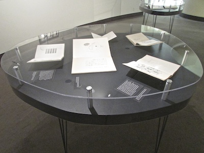 Oval tables custom made for the exhibition were inspired by Kitasono's aesthetic.
The organic, oval-shaped display tables were particularly eye catching. Hollis Goodall, a curator of Japanese art at LACMA, described the tables as being specially made for the exhibition, and the idea of their shape was taken from stones that Kitasono often used in his photographic works (called “plastic poems”) as well as on some covers of poetry books and magazines.
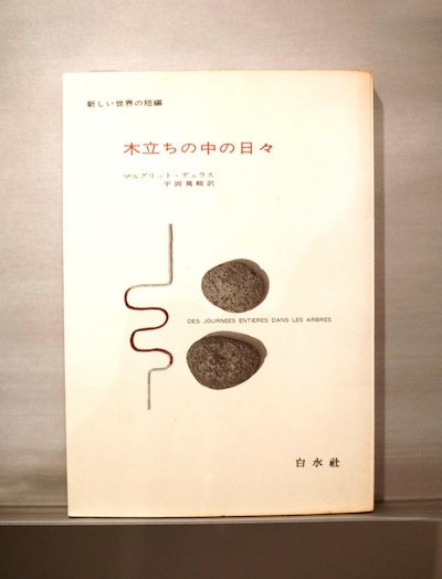 Kitasono Katue, cover of Whole Days in the Trees by Marguerite Duras, 1967, collection of John Solt, photograph by Lenny Lesser
The covers of VOU, the cutting-edge avant-garde magazine, are displayed on the walls. The presentation traces the transition of his longest-running journal from 1935 to 1978 (except during the Pacific War years). Goodall explained that, by lining VOU magazines side-by-side on the wall, one could see the various and rare colors Kitasono used, how he would manipulate type, and how he did not work in a grid, a strategy typically employed by many graphic artists. Instead, Kitasono worked with balance, space, and color. Viewers seemed intrigued by his aesthetic sense of color (which derived from the fine gradations of traditional Japanese colors), his use of small-font typography, and his graphic images placed on vast blank spaces.
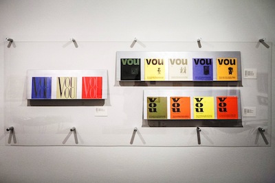 The arrangement of VOU covers in the exhibition. Photo by Lenny Lesser
The exhibition brochure is another visual feast for the eyes. LACMA graphic designer David Karwan’s deep insights and understanding of Kitasono’s oeuvre made it possible to make this creative, playful, yet sophisticated brochure with high-quality paper, which reflects Kitasono’s aesthetic.
 The exhibition brochure designed by David Karwan, courtesy of John Solt
Staging an exhibition is a collaborative process: the curator, designer, and museum staff all worked productivity together to create this innovative contemporary-art exhibition that matches the artistic caliber of Kitasono Katue.
In Japan, Kitasono has garnered more and more appreciation in recent years due to his exploration of various art forms—mainly poetry, photography, and graphic design. Interestingly, however, the interpretation and evaluation of his artworks are different for each genre. In the past 10 years, Kitasono has been particularly well known and respected in the Japanese graphic-design world for his highly refined sense of color, space, and aesthetic balance in design. As one of the pioneers of the field, Kitasono has been looked upon with awe and admired by design luminaries such as Takahashi Shohachiro (also a VOU member), Sugiura Kohei, and Asaba Katsumi.
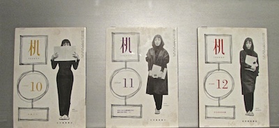 Kitasono Katue, covers of Tsukue 9, no. 10 (October 1958), Tsukue 9, no. 11 (November 1958), Tsukue 9, no. 12 (December 1958), collection of John Solt
Although Kitasono created most of his avant-garde poems in the middle years of the 20th century, his poetry works were often unappreciated by the Japanese poetry world, which was rooted in tradition at the time. Many felt his modernist poems made no sense, lacking emotion and therefore difficult to interpret. It’s only quite recently that Kitasono’s poetry has been favorably received by today’s younger generation, who tend to see them as simple, light, and, therefore, “cool.” Besides, his experimental poems fit well in the digital age. For example, “Monotonous Space” (1958) is one of his representative poems that breaks the notion of conventional poetry by putting the particleの [“no”] (meaning “of” or “ ’s”) at the beginning of lines, as well as using extremely short lines and few verbs. By changing the text direction of the poem from vertical (for traditional Japanese text) to horizontal (for Westernized Japanese text) and scrolling the text down on a computer screen, it becomes much easier to read his rule-breaking poems. Kitasono was ahead of the curve, and only now the times are beginning to catch up with his avant-garde antics.
Kitasono envisioned a future mode of poetry without words. His photography reflected this aim. He created photographic works he called “plastic poems,” using found objects such as stones, wire, string, and crumpled newspapers. His visual poetry gained international recognition and has inspired two generations of artists in the field. On view concurrently at LACMA is John Divola: As Far as I Could Get (through July 6, 2014), which examines a Los Angeles–based photographer who studied under Robert Heineken. Whether or not he is familiar with Kitasono’s work, the continuing trend of concrete/visual poetry can be found in Divola’s Polaroid images of sculpted objects, which were also made out of humble materials.
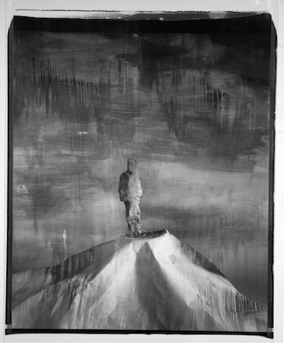 John Divola, Man on a Hill, 89MHA1, 1987–9, © John Divola
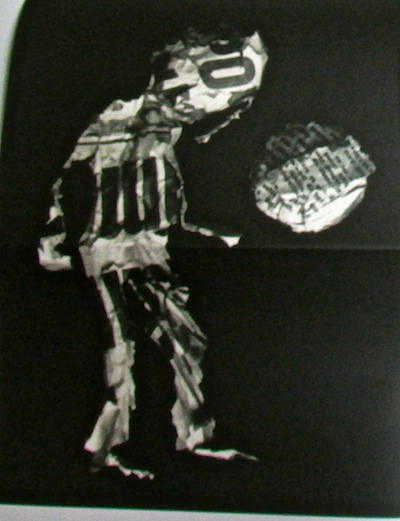 Kitasono Katue, Plastic Poem: “Night of Figure," featured in VOU magazine, no. 148, 1975, collection of John Solt
Kitasono Katue elevated poetry to the realm of fine art (and vice versa), and his genre-crossing artistic spirit and the intermedia products of his creative mind are moving as geometric organisms across time and space, with LACMA the first to focus on his work outside Japan.
Eiko Aoki, art critic and author of blog, ArtThrob in L.A. and Japan