The startling news of iconic L.A.-based graphic designer Deborah Sussman’s passing on August 19, 2014, stunned and saddened the design department at LACMA. Since early June we’ve been working with the 83-year-old internationally renowned designer on reissuing gift bags she originally created for the LACMA Store in 1965.
Deborah Sussman, born in Brooklyn on May 26, 1931, began her brilliant career as an intern at the revered Los Angeles–based Eames Office in 1953. The interdisciplinary studio enabled Sussman to work on a variety of projects, including exhibitions, films, packaging, and toys. There’s no doubt her experiences, collaborations, and travels on such Eames endeavors such as the exhibition Nehru: His Life and His India (1965) and the film Day of the Dead (1957) shaped Sussman’s sensibilities about color, pattern, and graphic forms for the rest of her career.
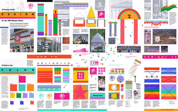
The influence of the Eames Office is unmistakable in Sussman’s most groundbreaking project, the environmental “kit-of-parts” graphics for the 1984 Summer Olympics held in Los Angeles. Sussman, then working with husband, architect Paul Prejza, as part of the design firm Sussman/Prejza, collaborated with the architectural firm, Jerde Partnership, to temporarily transform the sprawling city into an exuberantly unified visual metropolis. An explosive palette of vivid colors, simple shapes, and bold icons were mixed and matched, pulled apart, and layered, all in an effort to express the international essence of the games.
Deborah Sussman: 1984 Olympics kit of parts. Original photo
The strikingly bold, but infinitely adaptable, system mapped out everything from makeshift colonnades, rented tents, street banners, and staff uniforms to food packaging. The dazzling graphics worked successfully both on-site and for the global television audience. It could be said the super graphics of LA84 helped enliven the Olympics as an international celebration after the turmoil of the 1972 Munich games and the political boycotts of 1980 Moscow and 1984 Los Angeles.
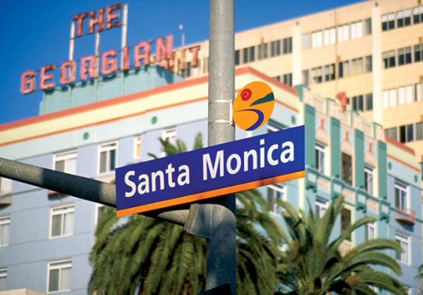
The 1984 Olympics highlighted the emergence of environmental graphics, and Sussman/Prejza went on to create wonderful graphic architecture, interiors, and identities for the likes of Apple Inc.; Hasbro, Disney; Westfield Corporation; the Museum of the African Diaspora; and the cities of Philadelphia, Santa Monica, and Culver City.
City of Santa Monica signage. Original photo
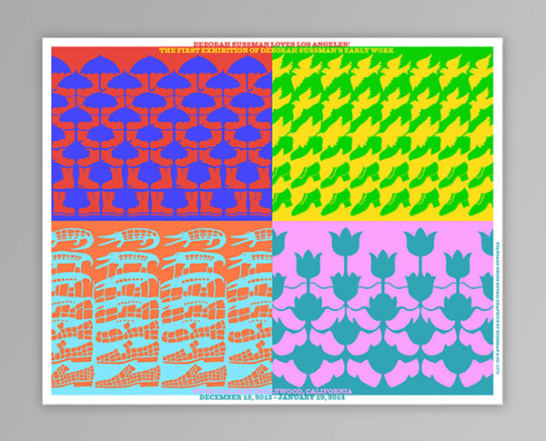
While Sussman’s environmental work earned her global recognition, much of her early career is underappreciated. Her first retrospective, Deborah Sussman Loves Los Angeles, was on view at Woodbury University's WUHO Gallery in Hollywood from December 12, 2013, to January 19, 2014. The exhibition, organized by Barbara Bestor, Catherine Gudis, Thomas Kracauer, and Shannon Starkey, focused specifically on Sussman’s early work, detailing her time at the Eames Studio through the 1984 L.A. Olympics.
Deborah Sussman Loves Los Angeles poster by Thomas Kracauer. Original photo
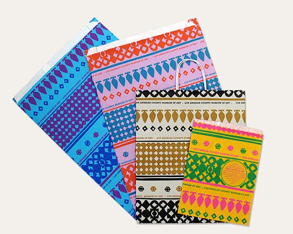
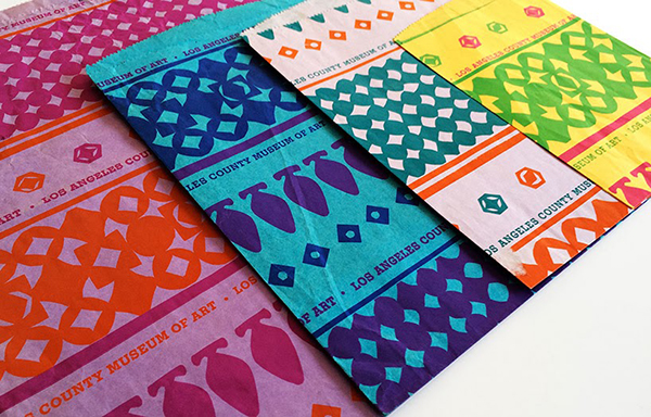
It’s here that LACMA rediscovered Sussman’s exceptional gift bags. With their exquisite (colored by her travels abroad, namely for the Nehru project) patterns positioned differently across various sized bags, the project is one that exemplified the influence of the play and folk art from the Eames Office.
The original bags by Deborah Sussman from 1965. Original photo
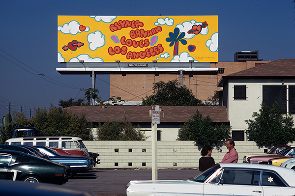
Other graphic treasures, including my personal favorite, a photograph of a billboard featuring custom lettering, which appears as the de facto film title in the short 1972 documentary Reyner Banham Loves Los Angeles, were part of the WUHO exhibition.
Reyner Banham Loves Los Angeles (1972) from Repazzo on Vimeo.
Billboard of Reyner Banham Loves Los Angeles. Photo by Thomas Kracauer
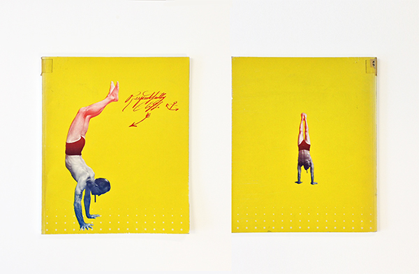
Another LACMA artifact from the WUHO gallery, which was also featured in LACMA’s California Design, 1930–1965: "Living in a Modern Way" exhibition, was Six More, a catalogue of an exhibition of L.A. pop art that accompanied the Guggenheim's traveling exhibition Six Painters and the Object when it came to LACMA. (It was guest curated by the Guggenheim's Lawrence Alloway.)
Deborah Sussman's design for the exhibition catalogue Six More. Original photo
Deborah Sussman's design for the exhibition catalogue H. C. Westerman Retrospective
I think Six More, the original shopping bags, and lesser-known catalogues Sussman designed for LACMA (Edward Kienholz from 1966 and H. C. Westerman Retrospective from 1968) illustrate how she began to morph her keen sense of color and two-dimensional form into a vibrant physicality that she eventually applied to the 1984 Olympics and later her environmental graphics.
Sometime after the exhibition ended at WUHO, Staci Steinberger and Bobbye Tigerman, assistant and associate curator in LACMA’s Decorative Arts and Design Department, had a conversation with Grant Breding, head of LACMA’s Retail and Merchandising, about possibly reissuing the vintage shopping bags. By the time the project reached the design studio, we were excited, but curious to how exact we could replicate the originals.
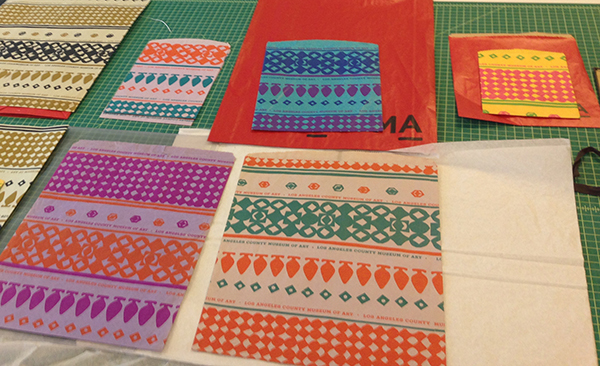
Comparing the originals and the 2014 reissue
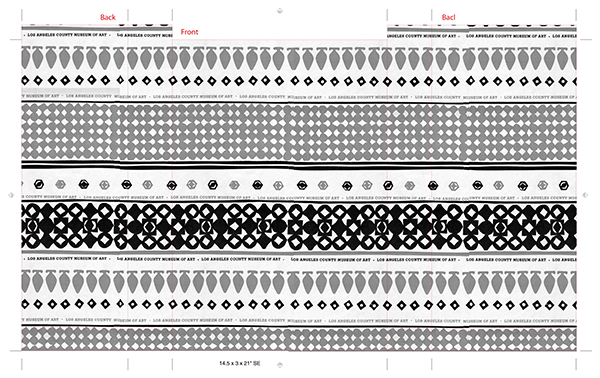
It was an interesting production challenge for our studio to undertake. One of the first hurdles to overcome was the layout. The pattern, which Sussman initially created with cut paper and applied to wide varying size of bag, had to be retrofitted for different proportions, without sacrificing the original playfulness of how the pattern appears unique to each bag.
Example of black-and-white schematic detailing where the pattern would hit folds and edges
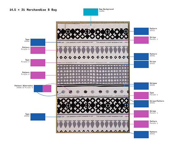
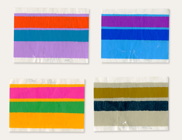
The second challenge, which concerned us most from the beginning, was how to recreate the colors from the vintage designs. One of the first things we learned in regard to the color was Sussman’s 1965 bags were “beater-dyed bags,” which meant that crushed color pigment was mixed with pulp before it was screened, pressed, and dried into paper. The other color production challenge was printing these facsimiles on a “flexo” press. This meant we had to layer the colors one onto another, resulting in the base color of each bag impacting the colors of the pattern. One of the most memorable moments of the process came when Deborah and my production director, Michael Pourmohsen, were wildly searching through a Pantone swatch book fully fanned out to find the “orange-est red.” After all colors were chosen and a few color tests were made, we approximately matched the stunning originals.
Example of Color Schematic detailing a bag's color scheme
Color tests known as "drawdowns"
Since the inception of the project, our studio worked closely with Deborah to ensure the best produced facsimiles as possible. She absolutely had an eye for color and it was a pleasure listening to her assorted anecdotes about traveling with Ray Eames and working on the Olympics.
While it’s extremely unfortunate she didn’t get to see the final pieces, these bags serve as form of tribute to Deborah's incredible legacy.

