
The LACMA team is working together from our respective homes to bring you interesting content and creative activities while the museum is temporarily closed to the public. We may not be able to gather together, but we can still create something beautiful.
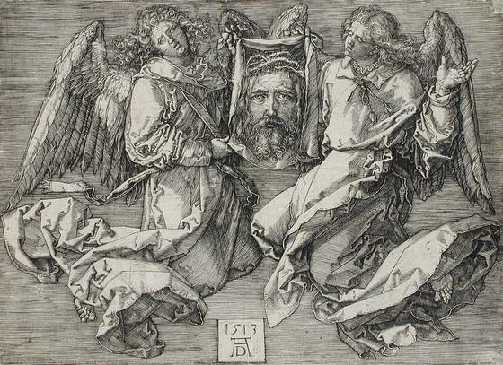
Crosshatching is a technique that grew out of early printing methods, where only one pigment (usually black) was used to represent both the outer lines of an object and the object’s interior tone, similar to the look of a black-and-white photo. The engravings of Albrecht Dürer are some of the best examples of how highly refined this effect had become by the 16th century.
We find crosshatching in children’s books and newspapers and magazines to this day. It’s a fun way to add some depth and drama to our drawings, and we can use a lot or a little, depending on how much detail we want to add.
Let’s get started!
First, we’ll consider what kinds of tools we’ll need to get the best results:
There are two basic types of ink drawing tools that we can start with—dip pens or fine-point marker pens.
A “dip pen” is a metal point, attached to a handle, dipped into a small jar of ink. The ink should be labeled “Waterproof” unless you plan to mix your work with an ink wash or watercolors. “India Ink” is the most common type. There are many pen nibs to choose from, but for drawing, the “Artist” style nib is most common. Always use a toothbrush to clean your nib after use to avoid clogging of the point. Dip pens don’t move smoothly across drawing paper—they tend to “snag,” which then causes your nib to spray ink onto your drawing in ways you probably didn’t intend! If you want to try the dip pen, start out with either Bristol Board paper (usually sold in pads), or “Hot Press” (smooth) illustration board. Your pen will easily glide across the surface as long as you start with the right kind of paper.
Fine-point marker pens are a more common tool for most people; they’re much easier to control and don’t require a smooth paper surface. There are a wide range of both colors and nib sizes available. A good size for this lesson is a #5 (45mm) Micron Black pen.
Have a pencil and eraser, also. Any pencil you’re comfortable with will suffice. For an eraser, kneadable erasers are the best, but any type of eraser sold at art stores (as long as they’re not tinted with color) will work. The traditional, kneaded eraser won’t leave any debris to be cleaned up, and is the least stressful to your paper surface.
We’ll start out with a black-and-white photo, which will show us varying degrees of what appears to be gray (in this case, degrees of Black). We will be using lines of Black ink, laid one on top of the other, at different angles, to suggest the appearance of gray in our image.
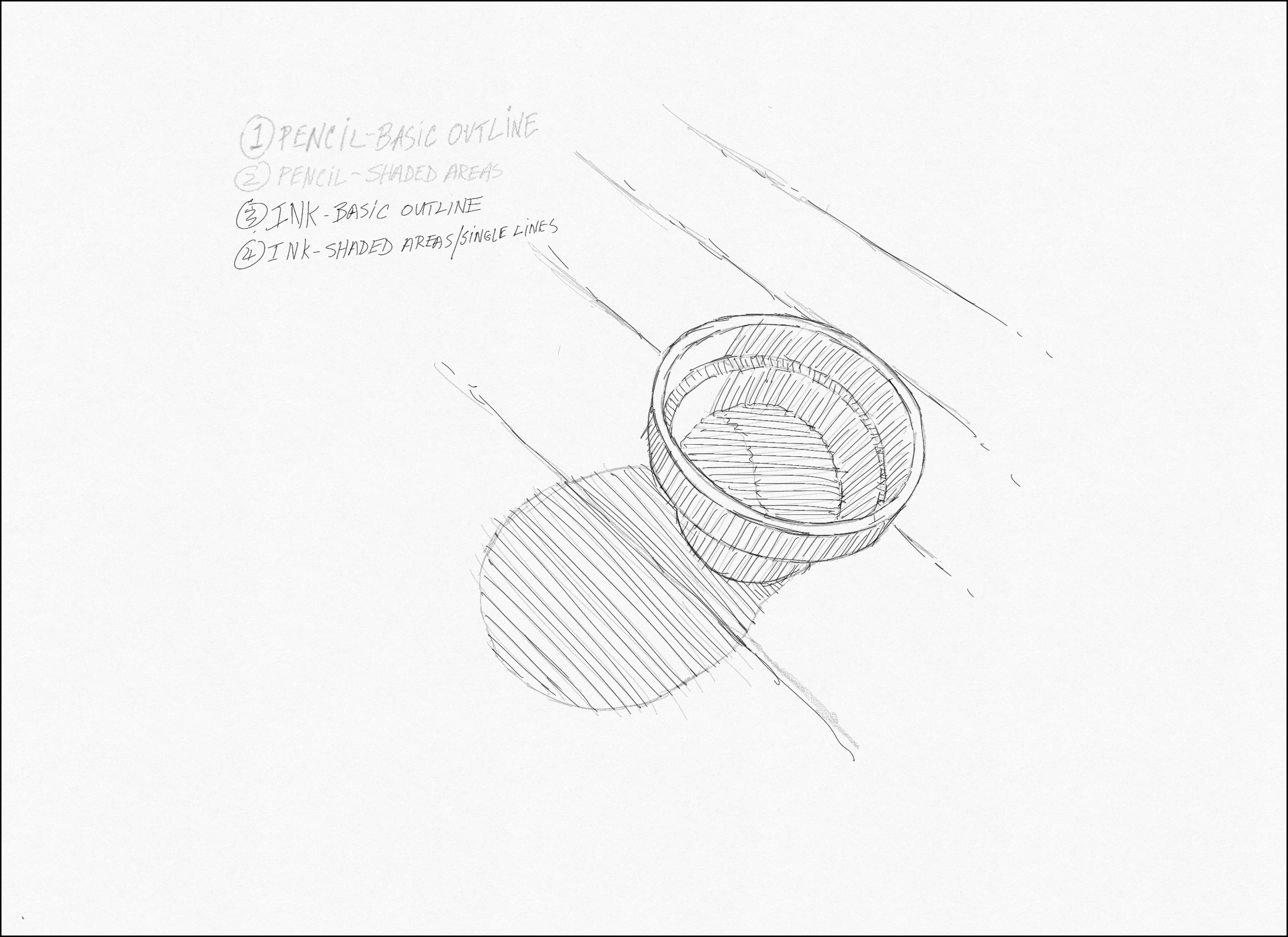
We’ll indicate the basic shapes in our image with a LIGHT pencil drawing of our subject matter (in this case, a small, circular clay pot with a shadow to one side). Too much graphite from the pencil will cause the paper’s surface to be powdery and slippery, and it can interrupt the steady flow of ink to the paper.

Here’s a simple image with basic shapes: a circular pot, a shadow, and some directional lines from a wooden table top.
First, we’ll draw this image lightly, in pencil.
Orient your page to the portrait position. Any size of paper will work, but Letter Size is what was used here. If you’re using a fine marker, printer paper is ok, but it’s very thin: put one or two extra sheets behind your paper to avoid getting ink on your table.
PENCIL—Basic Outline
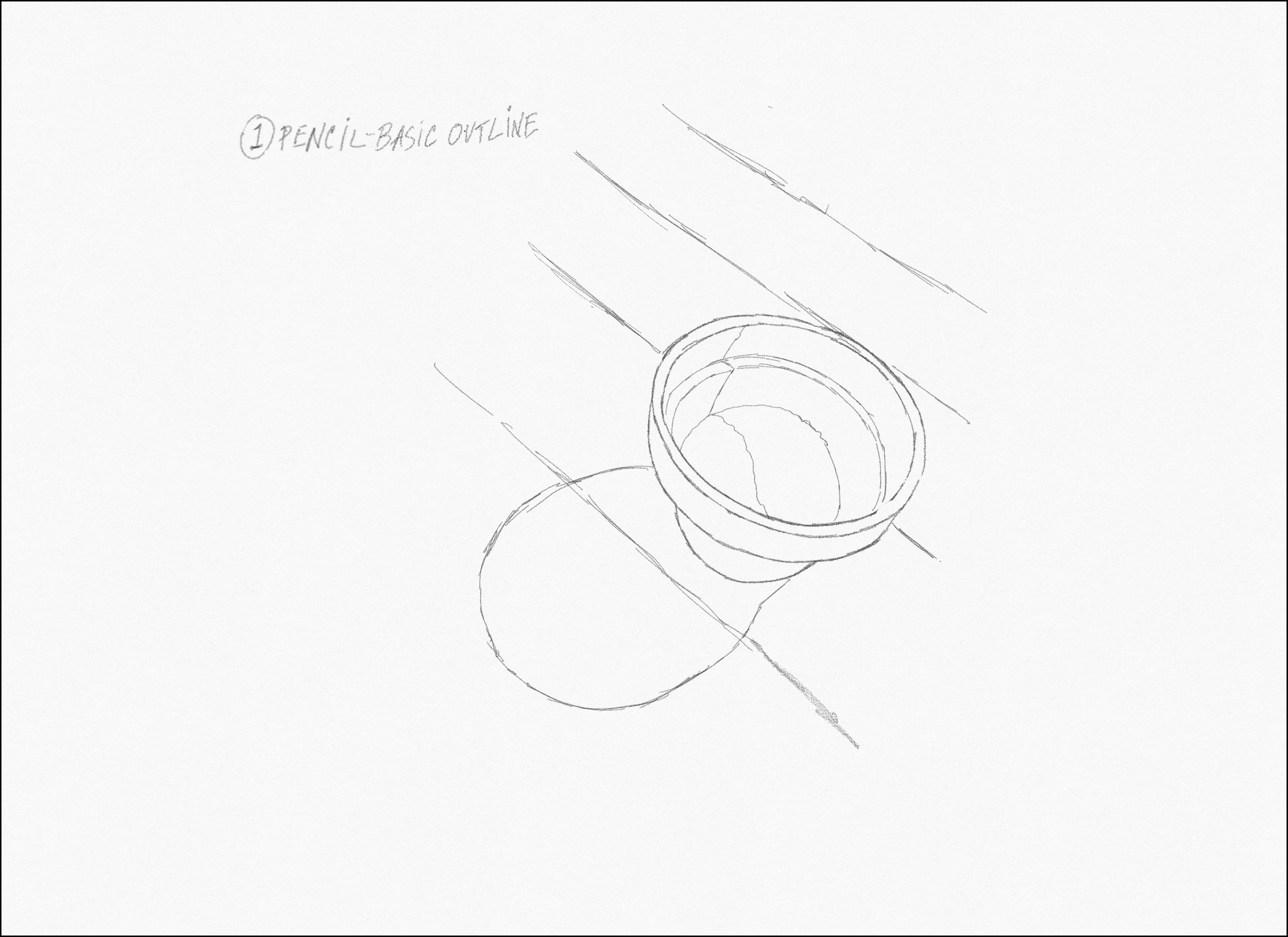
A couple of notes about drawing this image: yes, it is a circular pot, but the image you see is distorted by the camera lens, so remember—the shape you’re drawing is an oval that stretches from the upper left to the lower right. And the shadow is positioned at about seven o’clock on the lower left. Think of the pot and the shadow as equally-sized halves of a tilted “figure eight” (or peanut shell)—seeing it that way should make it easier to draw. Also, if you make a letter-sized print of this photo, you may want to draw two pencil lines on your printout—one vertical, one horizontal—to divide the picture into four parts. A grid like that can make it easier to arrange your image more accurately.
Be mindful of the few diagonal lines on the table (only the wood planks, not the grain)—they’ll help you position the shapes of the pot and shadow. Draw very loosely, lightly, and quickly—you should end up with more sketch lines than you need. Now, edit those lines down to the ones you want to keep. Once you have the basic outline as seen here, we’ll indicate some shadow areas with our pencil.
PENCIL—Shaded Areas
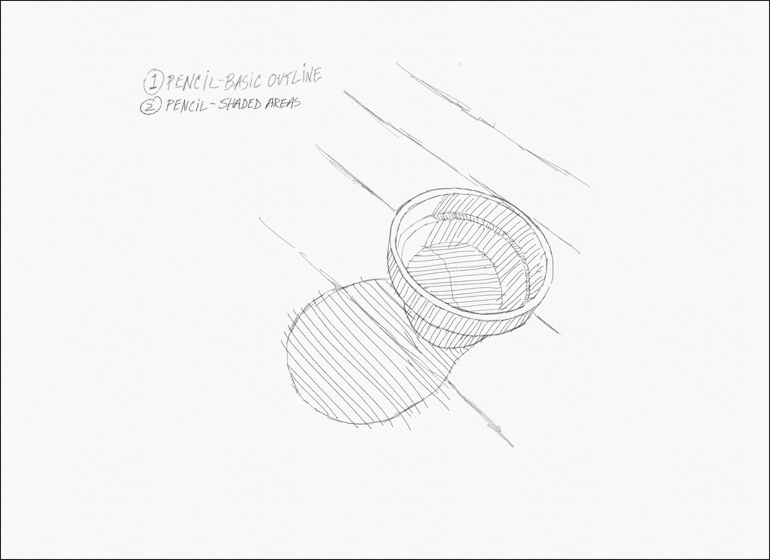
As you see, there are areas that are lighter and darker. In the areas that appear darker, loosely add hatch lines as seen here. Notice how they’re drawn at certain angles. Later, these will be used as shading reference for your ink pen, and the angles will guide your ink strokes to be drawn in a uniform direction.
Once you’ve got something close to looking like the sample drawing, try to lighten it up one more time to make sure you only have enough “information” to guide you when you trace the image with your ink pen.
INK—Basic Outline
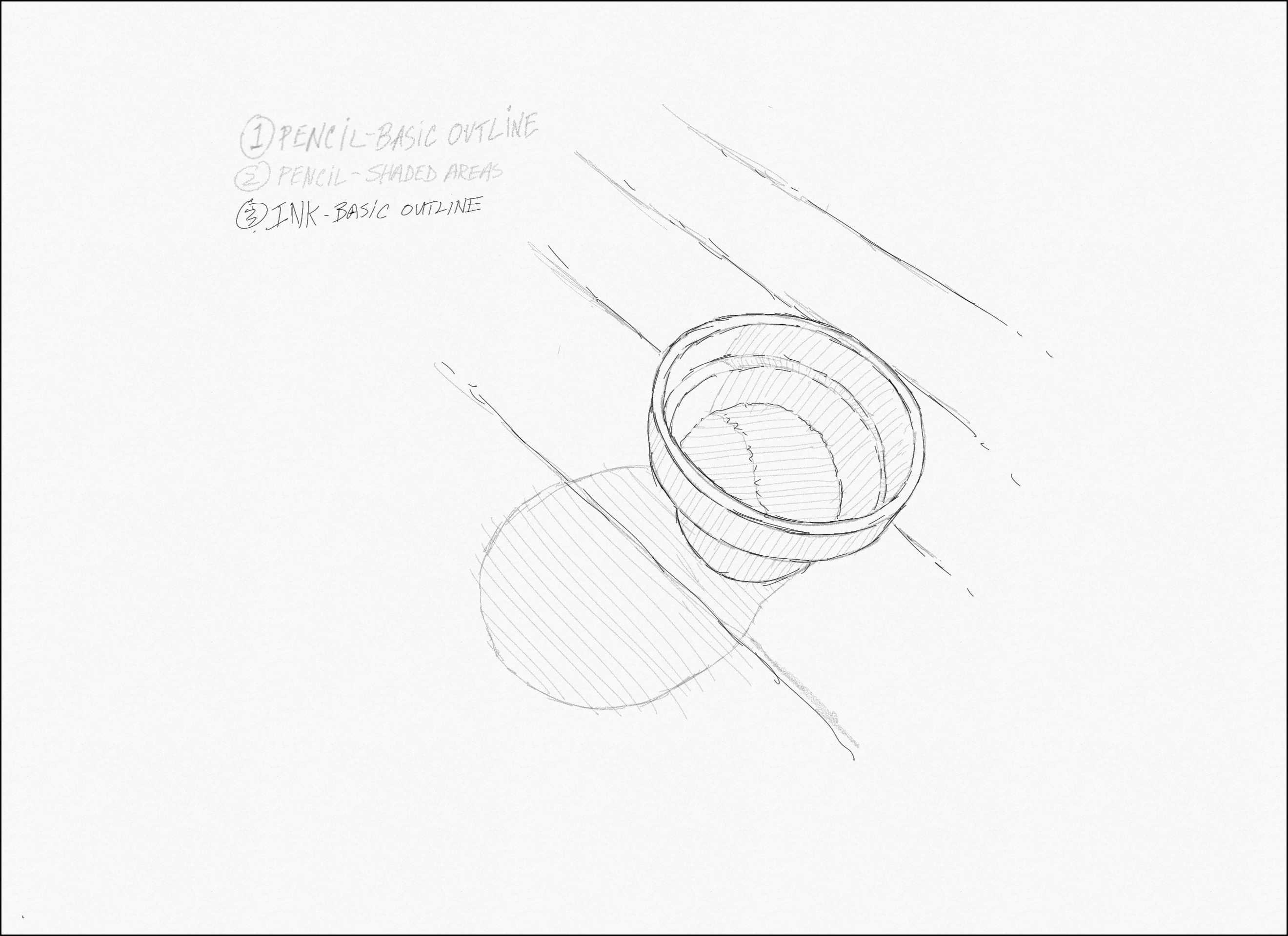
With your ink pen, trace your pencil outline first. You’ll notice I’ve used broken or sometimes overlapping short strokes with my pen. At this phase, we’re just trying to indicate basic shapes and line directions—we don’t want perfect, continuous ink lines.
INK—Shaded Areas and Single Lines
Add quick, loose, kind of consistently angled lines to indicate the shaded areas, which we’ll now start to build. These will be the first, single lines; we’re basically going to start layering lines on top of other lines after this, like sticks. These first single lines will guide us as we add subsequent ink layers. For the big shadow on the table, only draw diagonals—don’t outline the shadow shape, as indicated by the pencil.
Notice how the table top lines fade off. That’s to keep our composition focused on the image.
Erase Pencil Lines
Make sure your ink is dry. Gently erase all pencil lines (we’re taking the training wheels off!)
First Layer of CROSSHATCHING—Rounded Lines
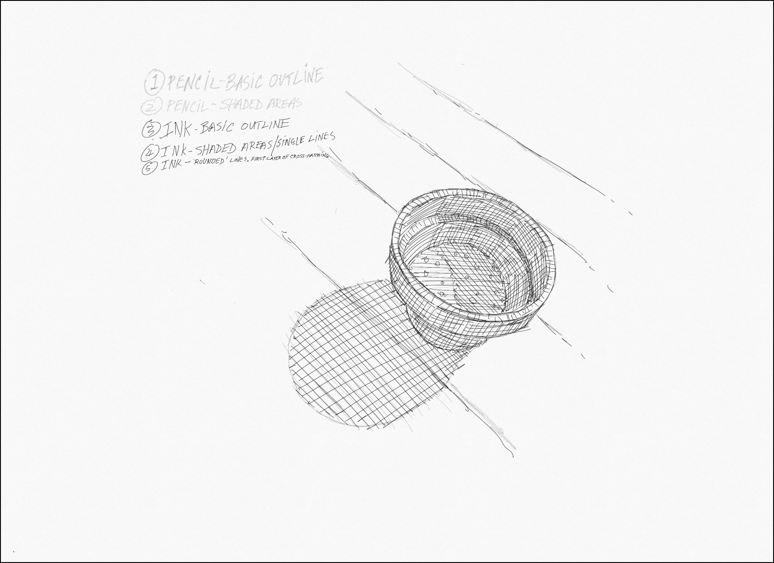
This is the layer that starts to add contour and depth. Notice how the lines you add are at a different angle from the first layer. Crosshatching works best by drawing lines in the opposite direction of the previous layer.
Add contour to the curved shapes by drawing your lines in a direction that imitates the curved shape, as seen here.
Second Layer of CROSSHATCHING—Background of Table
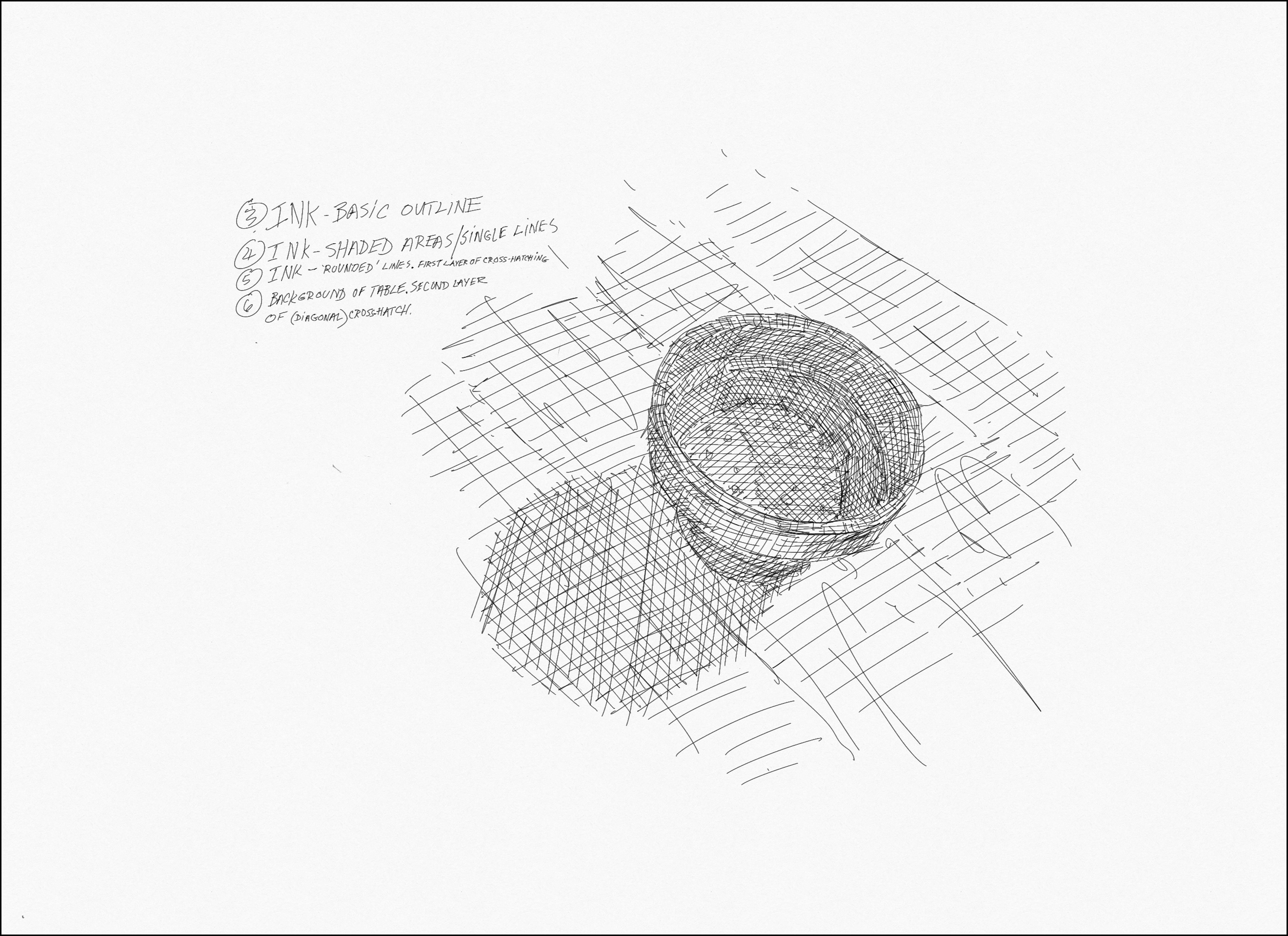
Now is the time to add just a few quick lines to indicate the area of the table top. This will give us a sort of baseline for our “gray tones”; the way we depict the lighter, less-emphasized part of our picture, will in turn indicate how dark or dense we want to go with the more shaded parts.
At this point, you’ll notice that your gray tones have become more-or-less the same—you almost can’t tell one area from another! That’s actually what we want!
Thicken the Basic Outline and Add Density to the Inside of the Pot
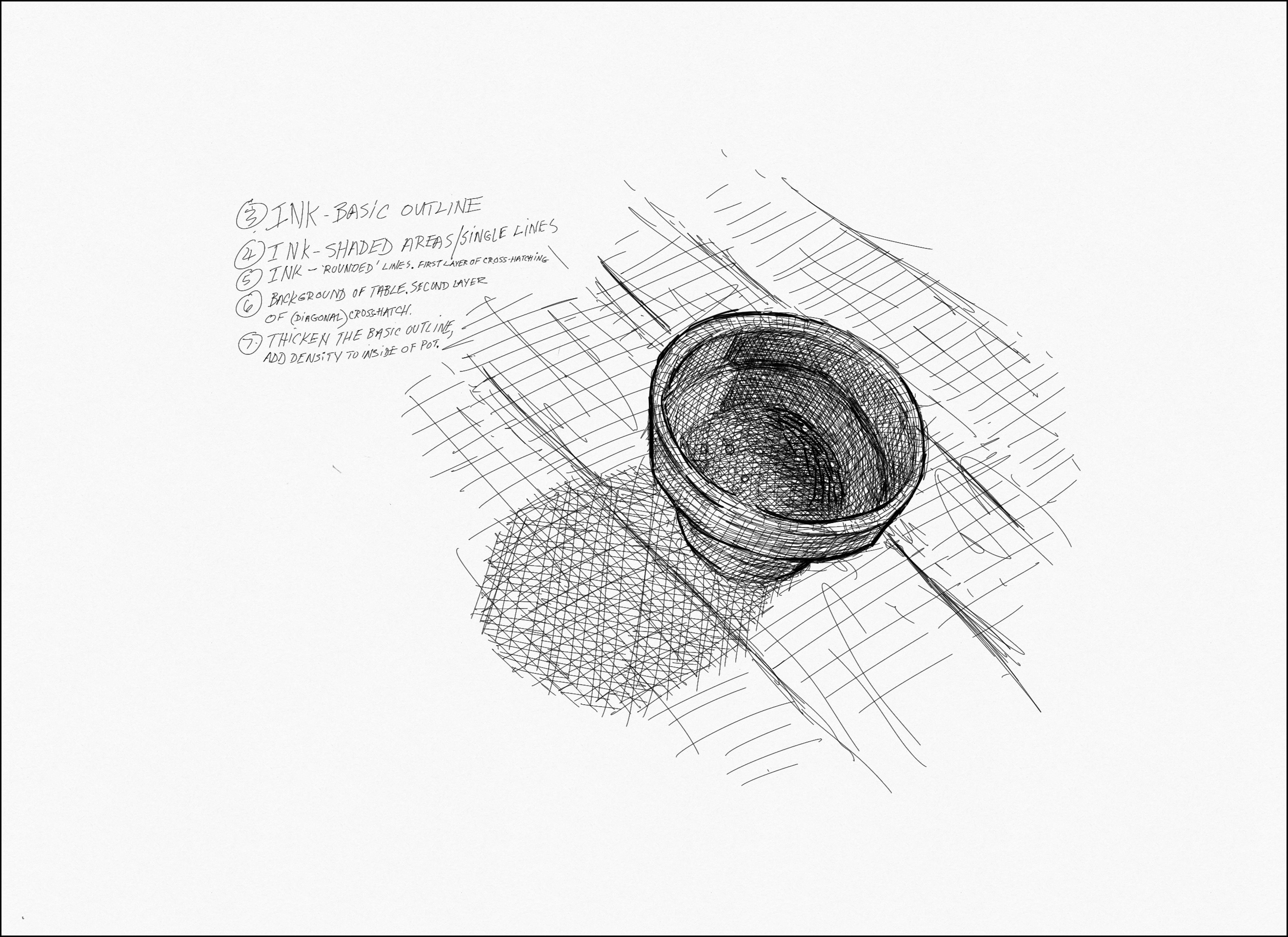
Now, look again at the original photo. Notice the subtleties in all the different areas of “gray” that define the curvature of the pot, the angle of the sunlight, the density of the shadows, and the dirt in the pot. Try to add shorter lines that only add to these small tonal differences. Don’t let the angle of your wrist limit you—rotate your drawing to facilitate the angles you need, to create new strokes that add more tone.
Double down on those original outlines to emphasize the shape of the pot! Add a few gestural lines to indicate the grain of the wood planks.
Keep Practicing!
After you’ve completed this lesson, you might want to repeat it. Create the exact same drawing, in the exact same order, but remember everything you wish you could have a “do-over” on.
Look at other artists in LACMA’s collection who can inspire you to continue crosshatching. Then consider how many images you could make from your own imagination and drawing style!
We would love to see your artwork! Post your creation to social media and tag @lacma.