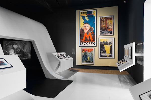
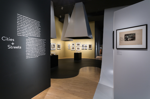
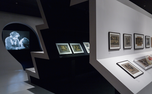
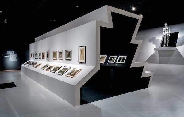
Frederick Fisher and Partners, Frank Gehry, Hodgetts + Fung, and wHy: these are only some of the design firms that LACMA has collaborated with on exhibition design. For the design of Haunted Screens: German Cinema in the 1920s, Amy Murphy and Michael Maltzan with Michael Maltzan Architecture, Inc. created a dynamic environment that highlights each of the five sections covered in the exhibition, while incorporating elements that encourage access between the areas. Murphy and Maltzan wanted to "provide visitors with a way to engage the spirit of the works through a contemproary series of form and spaces." The resulting design comprises undulating forms and unexpected spaces that reflect the dialogue between art, film, and design, all represented in many of the films that are part of the exhibition.
Haunted Screens curator Britt Salvesen interviewed Murphy and Maltzan about the design of the exhibition, which is currently on view at LACMA through April 26, 2015.
Britt Salvesen: How did you approach the design of this exhibition? In other words, what elements from the presentation did you consider when designing the installation?
Amy Murphy and Michael Maltzan: From the onset, we strove to develop a balanced approach toward the overall design, one that considered the choreography of movement, subtle effects of lighting, impactful graphics, and enriching sound elements—all while embracing the aesthetic themes, historic context, and, most importantly, the curatorial interpretation of the objects themselves. This led us to concentrate on the various ways bold architectural abstraction, strong form, inventive juxtaposition, and a contemporary character to the installation could complement the collection instead of directly replicating the distinctive visual vocabulary of the films of this period.
BS: In what way do you hope visitors will experience the exhibition through the architecture?
Amy Murphy and Michael Maltzan: The show is situated in a long gallery, requiring that you enter and exit from the same general location. Due to the layout, we needed to bring visitors through the entire length of the space, then back to the front again. We began to think that we could create an ensemble of different spaces, which would offer a new experience and new information each time a visitor moved through a particular theme. We hoped that the pattern of movement itself could become a way to communicate the unfolding ideas in the works and move beyond simply leading people didactically from one object to the next.

Also, from the beginning of the design process, we were sensitive to the fact that this show was being presented here in Los Angeles (with its own rich film history) and that many visitors would have a fairly sophisticated understanding of this period of work, as well as an understanding of the play between cultural millieu and cinematic production in general. We worked to represent that interplay between the framed objects and the selected film excerpts in the layout of the exhibition, as two inherently interconnected but also distinct sets of practices. Rather than directly placing the film images right next to the selected works within each theme, the exhibition allows the films to remain true to their form, ineffable wholeness, and within their more "natural" context of a darkened screening space.
Finally, this period of filmmaking has such a pronounced aesthetic that we associate with German Expressionism. Sometimes it’s hard to see the amazing work through the veil of its historical "look." We were searching for ways in the design to capture the spirit and themes of that period but reinterpret it through a contemporary design lens, without simply mimicking Expressionist stylization.
BS: What type of design challenges did you face having to integrate the over 250 objects in the exhibition? How did you address these challenges?

AM and MM: In our first design team conversations, curator Britt Salvesen described her vision for the five themes: Madness and Magic; Myths and Legends; Cities and Streets; Machines and Murderers; and Stairs. Our early thoughts about the "script" was to establish a spatial experience for the visitor, which would heighten a sense of mood of the overall exhibition and simultaneously allow for more intimate moments of attentiveness and focus on the individual works and artifacts.
Interestingly, that dual ambition led us to a more "singular" form. The "carpet," which is a floor, a ceiling, and a wall at different moments in the exhibition, allowed us to intensify contrast such as light/dark and compression/expansion, which are fundamental to the films. It also allowed us to create "outside" spaces, such as the space filled with columns, that could give the works on paper, books, and posters their own thematic context within the show.
As we were beginning work, the LACMA was able to add a special room containing selected works from contemporary filmmaker Guy Maddin. This was particularly exciting to us. Placed midway through the visitor’s journey, this room creates a very powerful moment that seems to speak directly to the work in the show, and also connect you to our contemporary moment. It’s a perfect pause before your move back through the show and encourages visitors to enlarge their own contextual and aesthetic frame of reference for this period.

BS: What new insights did you gain about German Expressionist cinema while working on this exhibition?
AM and MM: We both have a long-standing and deep appreciation of German Expressionist cinema as an art form that related to both intense aesthetic practice as well as defining a period of thought about urban experience. Something that we hadn't fully realized, however, until we were in our conversation with Britt and her team was how intensely collaborative this period of film production was. Painters, sculptors, graphic designers, composers—all were a part of these films. Many of the iconic films of the Weimar period were the products of a uniquely collaborative environment—each film is a powerful expression of many disciplines working at the top of their game. As designers in Los Angeles, a place of enormous creativity and also many deeply creative cultures, we were excited by how much the work of the period can teach us. These films can stand in as a model of collaborative excellence, where state of the art technology, insightful cultural critique, and daring levels of visual expression all are combined to powerful and lasting effect.


