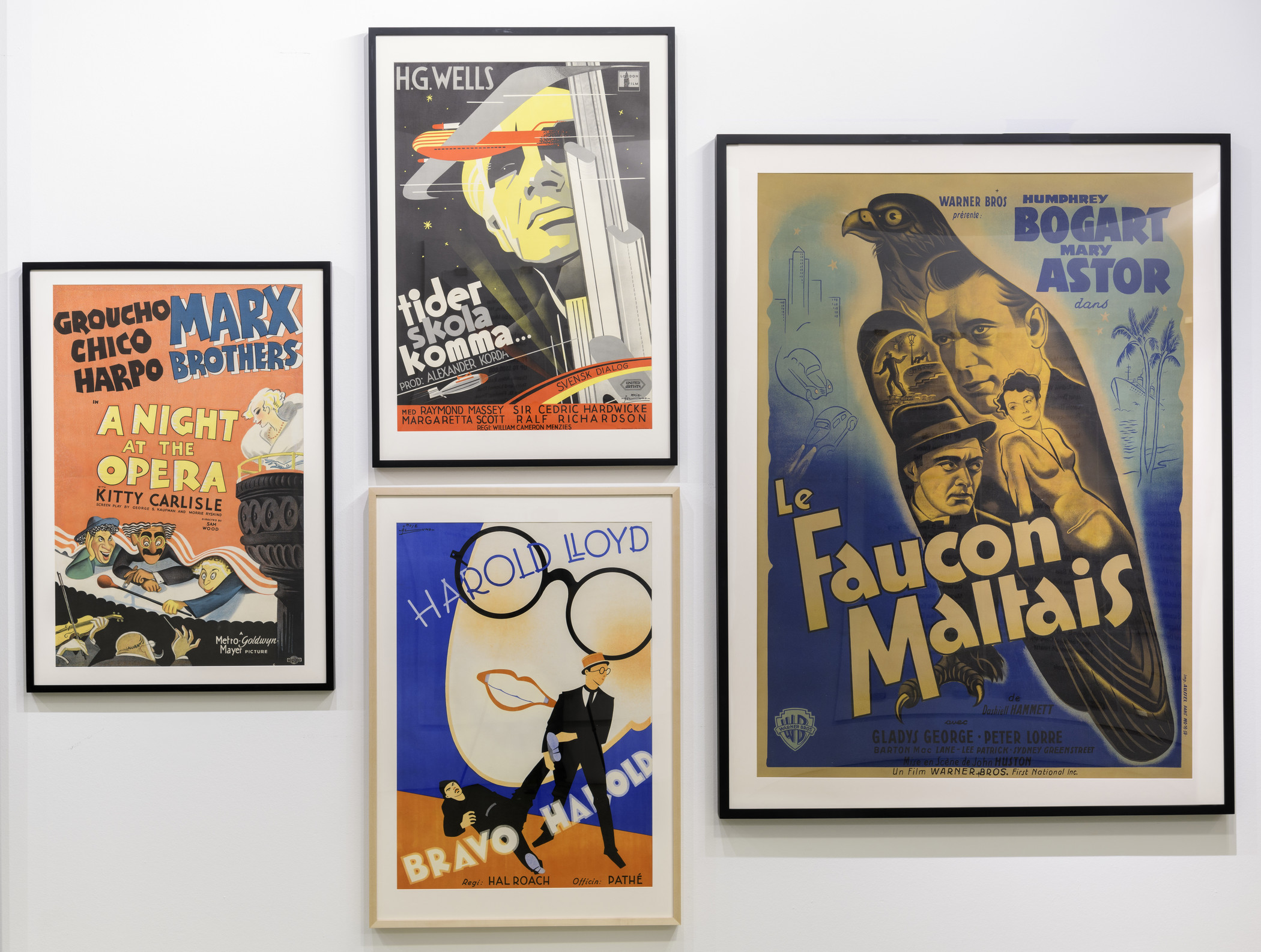
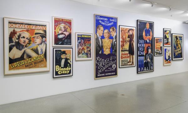
As designer, art director, and producer, Mike Kaplan has first-hand experience in crafting movie campaigns and posters, the most famous among them A Clockwork Orange (1971) and "The Ultimate Trip/StarChild" campaign for the re-launch of 2001: A Space Odyssey in 1970. That expertise shows in his remarkable collection of international film posters, which he built up over decades. In this interview and the live walkthrough posted below, Kaplan discusses his lifelong love of the film posters and how he came to select several of the works in the very popular The Art of the Movie Poster: Highlights from the Mike Kaplan Collection installation, which has been extended to August 26, 2018.
1. How did your interest in movie posters begin?
When I was a child, we got the Sunday New York Times Arts & Leisure section every week in Providence. The beginning section would always have full-page ads with the plays coming to Broadway. I would take those out and use pastel and chalk to color them in. When I would get to New York, I would compare the colors were to what I had done. So the beginnings were really that process.
2. What was the first vintage poster you ever bought?
The first vintage one I got was in New York, at a funky memorabilia shop on 6th Avenue. The owner was working with me and he had extras so he gave me a couple, including The Postman Always Rings Twice. It was a really good one, still quite collectible.
Toward the end of the seventies, I went to this memorabilia store on Melrose called Chik-a-Boom. There was a whole stack of movie posters in big plastic sleeves leaning against the wall. The first one was a poster for Irish Eyes are Smiling, a film from the forties. It was a Fox Musical, a stone litho so the texture was really rich. It starred June Haver, who was one of the Fox blondes in the tradition of Betty Grable and Marilyn Monroe. I had a crush on June Haver as a kid, and the poster was really well designed. That was the first vintage poster I bought.
.jpg)
3. Many of posters in your collection are incredibly rare, with only one to three known copies. This includes the impressive three-sheet poster for Annie Oakley, which is on view now. Can you talk a bit about what makes this poster stand out from others for the same film?
The appeal of Annie Oakley, like the appeal of all the posters—it’s something I just see for the first time, I don’t really analyze it initially why I like it, I know I just like it and it should be in the collection. The three-sheet poster has the full length of Barbara Stanwyck as Annie Oakley. It’s a perfect representation of her character in the movie, a sharp-shooter with a rifle and the star of Buffalo Bill’s Wild West show. A legendary figure in a legendary pose. The background coloration is really perfect for the wild west, with prairie browns and golds. The logo is great, Annie Oakley with the bullseye in the “O.” It’s one of Stanwyck’s great performances in the early part of her career, directed by George Stevens. It’s a terrific film and the poster captures the movie.

4. The celebrated caricaturist Al Hirschfeld created the wonderful poster for A Night at the Opera in this installation, as well the poster for The Big Idea that was on view in the first part of the show. I know you have several other examples of his work in your collection. What draws you to Hirschfeld's work?
Hirschfeld goes back to the beginning to when I was kid in Providence with the New York Times Arts and Leisure section. He would do caricatures of the plays at least two or three times a month. I would cut those out and save them in scrapbooks. I think he is a genius. He’s always identified as a caricaturist but he goes well beyond that. He captures people in his use of drawing and line. There are certain pieces that he’s done with maybe five different lines, but he gets the whole person. As I got into the whole movie poster collecting passion, I would hunt out any Hirschfelds I could find. They’re great, the use of color is as creative as the black and white drawings. A Night at the Opera is one of the posters that I can say is a great poster for a great film.
5. One thing that really sets your collection apart are the international posters.The current installation includes posters from Italy, France, Sweden, and Austria, as well as the U.S. And I know you also have posters from other places, including Germany, Belgium, Argentina, Japan, in your collection. What stands out to you about how artists from these countries depict American films and stars?
I didn’t know about foreign posters until a couple years after I started collecting U.S. ones. That opened up a whole new world. It was amazing to see how the different artists from different countries interpreted the film and what they used to promote it in those markets. During this period, the foreign offices of the major studios were able to create their own artwork if they didn’t like the American artwork, tailoring it to what they thought their markets would respond to. They would use local artists that were from their various countries. As a result, you get a great variety of imagery for different films from that period from many different countries. In many cases, particularly in France, Italy, Sweden, and Denmark, they were able to sign the artwork that they did, unlike America where very few artists were able to get recognition with their signatures on the pieces they made.
Each country has their own style, but the Swedish posters were the most remarkable to me because they look so modern. There was nothing like them, they look so advanced in 1929 or 35 when they made them and I think they look as advanced today. They are sophisticated and accessible at the same time. Scandinavian design is unique; it’s very clean. When you see a Swedish poster, you know it’s from Sweden immediately, there isn’t any doubt about it.
6. In your view, what makes a truly great poster?
The poster has to grab you with an image that attracts. It has to be powerful or interesting or stylish or intriguing. And it also has to somehow capture the feeling you have about the movie so that when you look at it, it entices you to see the movie. And when you leave the movie, you look at the poster and you have some of the experience of watching the movie. It also has its own needs as an art form. Movie posters have demands of layout and credits and it’s got the pitch in it—what you want to sell. An ideal movie poster should have a great design, and it should be a souvenir of the moviegoing experience.
The Art of the Movie Poster is on view in the Ahmanson Building, Level 1, through August 26, 2018.


