
The exhibition To Rome and Back: Individualism and Authority in Art, 1500–1800 (on view through March 17, 2019) traces the move to, and ultimately through, the Counter-Reformation resurgence of Rome as a cultural powerhouse around 1600. Consisting of work almost entirely from LACMA’s permanent collection, the exhibition not only required a reconsideration of the strengths of our holdings across a number of departments, but also allowed us to take a look at the installation strategies of these objects. New mounts were made, frames were touched up, and, in the case of Francesco Panini’s (1745–1812) St. Peter’s, the Basilica and the Piazza (Figure 1), the exhibition curator, Leah Lehmbeck, requested a new “French mat.”
A brief introduction to mounting practices
Today, museums and private collectors commonly mount their works of art on paper in “window mats”: the object is hinged onto a sheet of stiff mat board, and attached to this backboard is a second mat, this one with an opening or “window” through which the work can be viewed. This system for matting prints and drawings, which dates to the 19th century, serves important functional purposes. By providing a physical support to the fragile paper, a mat protects the work when it is handled and stored. The mat also facilitates framing when the work of art is displayed in exhibitions.

Such mounts also play an aesthetic role in the presentation of a work of art, especially when they are embellished with drawn ornamental borders or frames. The practice of decorating mounts among collectors of drawings (and later of prints) can be traced at least to Giorgio Vasari (1511–1574), the Italian artist and author of the Lives of the Artists. Vasari mounted his extraordinary collection of drawings onto large album pages—often artfully arranging several drawings on a single page. He drew elaborate, richly ornamented architectural frames around the drawings as well as cartouches bearing the artist’s name. While Vasari’s collection, known as his Libro de’ disegni (Book of drawings), has been dispersed, a small number of the album leaves have been preserved.

The decorative styles of mounts evolved across European collections through the centuries. Notably, the great French collector and dealer, Pierre-Jean Mariette (1694–1774), keenly aware of this tradition and of Vasari’s example, mounted each of his drawings individually (which he then gathered and stored in portfolios). An example of a drawing on its original Mariette mount is in LACMA’s collection, above. The drawing by Boeckhorst (c. 1604–1668), a German-born Flemish artist, was laid down onto a white card backing and framed with ruled lines in black ink and a gold band. The rest of the mount was then covered with strips of blue paper and decorated with additional framing lines as well as a cartouche inscribed with the artist’s name. The framing lines of slightly different widths create a subtle illusion of depth, and visually anchor the drawing on its mount.
Mariette’s decorated mounts, and others like them, not only helped preserve the delicate works of art on paper they hold—but they also enhanced the viewer’s experience. While the majority of LACMA’s old master prints and drawings collection is mounted on unadorned, ivory-colored window mats, on occasion we will embellish a mount when a work requires a special presentation.

A new mat for Panini
To prepare a new French-style mat for Panini’s, St. Peter’s, the Basilica, and the Piazza, an 18th-century Italian etching colored by hand with watercolor and gouache, the mat maker and curator first selected an appropriate color mat board that would be sympathetic to the appearance of the artwork.

Once the mat board was selected, its decorative design was discussed. Such considerations as borders or framing lines in the artwork itself as well as the amount of detail in the composition determine the overall design for the French mat. Samples were created for visual reference, which included ruled framing lines of varying number, thickness, and color; watercolor panels; and gold or silver foil filets.
Once the mat maker and curator determined the design, measurements were lightly marked on the mat with pencil. These serve as starting and stopping points for laying down the pen lines and also indicate the position of such additional decorative elements as watercolor panels and gold foil bands.
In the case of the Panini, it was decided not to add a watercolor panel, as the artwork itself was laid onto a mount with a pink watercolor border. To create a watercolor panel, water is first applied with multiple passes of a brush to the mat, thus improving its receptivity to the watercolor. Once the mat is dampened, the watercolor is carefully and quickly applied in a counter-clockwise movement. Speed of execution is critical to ensuring that the border does not dry out during the process, which could result in an uneven layer of watercolor. To avoid flaws such as streaks in the panel or painting outside the line, the brushwork and quantity of pigment applied must remain precise and constant. This procedure is repeated until the desired saturation of color is achieved.
.jpg "Adding a line to a mat using a ruling pen")
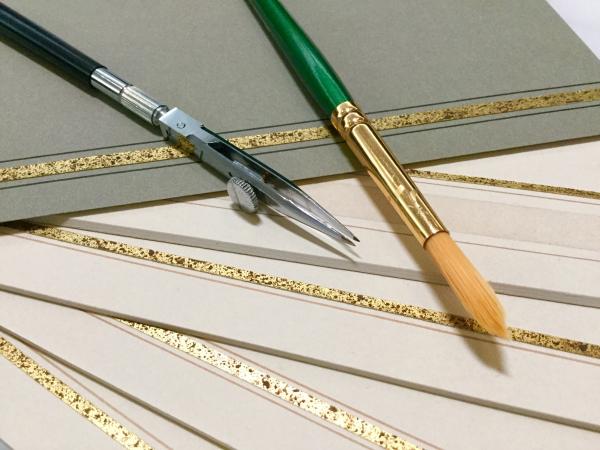
The framing lines, typically executed after the watercolor panels, were drawn using a ruling pen with ink and a weighted flat bar as a guide. The ink, made from watercolor and gouache paint, was mixed to a consistency that was thick enough to stay in the ruling pen, but thin enough to flow out onto the mat evenly. Ink that is too thin (or watery) can bleed out, causing a large, unsightly deposit of ink. When drawing the line, a slight change in the angle of the pen or a tremor can result in an irregular line. Thus body positioning and stance are crucial when laying down the lines. The placement and handling of the flat bar are also important, given its close proximity to the wet ink.
.jpg "Cut and paring down gold foil")
Foil bands were also used as a design element. A sheet of metallic paper was “textured” with splatters of watercolor and gouache paint to give it an antiqued appearance. This paper was then cut into strips of the desired width. Because the metallic paper we used was quite thick, we had to delaminate it (paring down the back of the paper to decrease its thickness). As a final flourish, the strips of metallic foil were adhered to the surface of the mat. The newly matted work was framed and placed on view in the exhibition.
.jpg "Detail of the new French mat on Panini’s St. Peter’s, the Basilica, and the Piazza")
Beginning today, To Rome and Back: Individualism and Authority in Art, 1500–1800 is closed to reinstall several light-sensitive works. Come see this print—and its new French-style mat—and other new works when the exhibition reopens later this week!