
How closely do you look at a work of art?
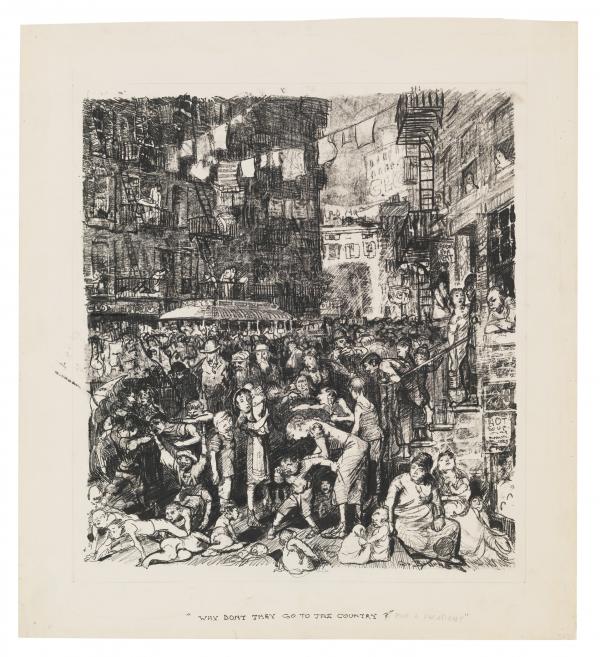
Detailed examination of an object can sometimes completely change our identification of its materials or manufacturing technique, as with the recent case of George Bellows’s Why Don’t They Go to the Country (for a Vacation)? from LACMA’s permanent collection. This wonderfully complex piece was studied in 2012 when requested for a major exhibition of Bellows’s work at the Metropolitan Museum of Art, the National Gallery of Art, and the Royal Academy of Arts. The previous media identification of “transfer lithograph” seemed incorrect, and a team including art historian Robert Conway, NGA Conservator Kimberly Schenk, and NGA curators investigated the artwork and found it to be made without a lithographic stone at all!
When this artwork was again requested for a loan to the Getty Center, a further investigation into determining its printing process began. With collaboration between conservators, curators, and scientists between three different Los Angeles museums, the previous “transfer drawing” identification was confirmed, but slightly amended. It was discovered to be a unique type of transfer drawing called a “direct trace monotype” that uses printing ink in a hybrid between a print and a drawing.
Our journey from one media identification to another involved connoisseurship, scientific analysis, microscopic examination, and the creation of many mock-ups. Such in-depth examination highlights the fascinating world of technical art history and reinforces that we should always take time to look carefully.
GEORGE BELLOWS AND HIS WORK
American artist George Wesley Bellows was born in Columbus, Ohio, in 1882. A star athlete and promising artist from a young age, Bellows attended the University of Ohio before leaving in 1904 for the New York School of Art. There he trained with Robert Henri and the other artists of the “Ashcan School,” who drew artistic inspiration from all strata of American society, particularly the urban lower classes. While Bellows’s famous depictions of boxing matches and crowded New York City tenements are rather more optimistic than history would have us believe, their subject matter was still unorthodox at the time.

One such image is that seen in Bellows’s painting Cliff Dwellers (1913), which is replicated and slightly modified in several iterations including Why Don’t They Go to the Country (for a Vacation)? The image of urban dwellers in the crowded street escaping the oppressive heat of their tenement buildings appears in the painting, two transfer drawings, and one smaller watercolor. In each of these works, narrative elements of the composition are slightly altered in order to work out a passage of light or shadow or to focus on a particular grouping of people.
Bellows’s political objectives seem to change with the different compositions as well. Cliff Dwellers paints the crowded streets with pleasant colors and a clean, pure light, with a romantic title evoking the native peoples of the American Southwest. It is important to note that viewing such a painting was far more likely for the urban elite rather than the lower classes. On the other hand, Why Don’t They Go to the Country features a darker, grittier depiction of the urban poor and, along with the title, satirizes the upper classes who could not comprehend why such people could not afford to leave the city during summertime. Furthermore, the image was reproduced in The Masses publication, a more democratic medium than painting, and one dedicated to socialist politics.
SCIENTIFIC ANALYSIS
The first option—and least invasive option—for analysis of a work of art is often to view it with different wavelengths of light. Using visible light and ultraviolet (UV) and infrared radiation (IR) tells us a world of information about the materials present. Different media may fluoresce dissimilarly when viewed with UV light, indicating which medium is used where on an artwork. Carbon-based media absorbs infrared radiation and appears black, while organic or dye-based media will “disappear” when viewed with IR.
Images taken by LACMA conservation photographer Yosi Pozeilov indicate that all media contain carbon, consistent with our predictions of both an oil-based printing ink and a carbon-based drawing or writing ink applied on top. UV light does not indicate any discernable differences in media, but it does highlight areas where adhesive was once applied around the margins.
?, 1913, Los Angeles County Museum of Art, Los Angeles County Fund, photo © Museum Associates/LACMA, by Yosi Pozeilov. Left: Long-wave UV illumination—does not indicate significant differences in black drawing media binders, but highlights adhesive around the edges; Right: Infrared radiation—black image indicates the presence of carbon-based pigments, which absorb IR radiation and appear “visible” in the image")
Further analysis of the Bellows work was carried out in the LACMA Analytical Laboratory by conservation scientist Laura Maccarelli. She examined the printing ink and liquid ink applied by brush and pen with a technique called Fourier Transform Infrared Spectroscopy (FTIR). This technique uses infrared radiation directed at an artwork to detect the unique absorption characteristics of the materials present. Furthermore, FTIR is a non-destructive technique that does not require taking a sample of material from the object being analyzed.
We wanted to attempt to characterize the binders of the different black ink media present to determine if they had differing oil or wax components that might hint at the use of various lithographic media. FTIR analysis did not detect any noticeable differences, simply indicating the presence of oil, which is to be expected in an oil-based printing ink. While not immediately helpful in concretely determining if the image was created by lithographic stone or transfer drawing, at least the presence of oil detected in the media is consistent with both techniques.
CONNOISSEURSHIP AND CLOSE EXAMINATION
We began our investigation with a detailed comparison of prints and drawings by Bellows and other artists. This included visits to the conservation labs of the Getty and the Huntington Library, Art Museum, and Botanical Gardens.
![Getty curators Stephanie Schrader and Edina Adam, Getty conservator Michelle Sullivan, and former LACMA (now Getty) curator Naoko Takahatake examine the Gauguin “oil transfer drawing,” image courtesy of Madison Brockman. Foreground: Paul Gauguin, Eve ['The Nightmare'] (recto); Eve ['The Nightmare'] (verso), c. 1899–1900, The J. Paul Getty Museum, Los Angeles; Background: William Blake, Satan Exulting over Eve (detail), 1795, The J. Paul Getty Museum, Los Angeles](/sites/default/files/attachments/IMG-0064.JPG "Getty curators Stephanie Schrader and Edina Adam, Getty conservator Michelle Sullivan, and former LACMA (now Getty) curator Naoko Takahatake examine the Gauguin “oil transfer drawing,” image courtesy of Madison Brockman. Foreground: Paul Gauguin, Eve ['The Nightmare'] (recto); Eve ['The Nightmare'] (verso), c. 1899–1900, The J. Paul Getty Museum, Los Angeles; Background: William Blake, Satan Exulting over Eve (detail), 1795, The J. Paul Getty Museum, Los Angeles")
Our quest first led us to the Getty to examine an “oil transfer drawing” by Paul Gauguin, titled The Nightmare. This work was made in the manner of the artist’s other experimental prints beginning in 1899, and bears the same characteristic “fuzzy” line quality as the Bellows work. I had experience creating and identifying so-called “direct trace monotypes” or transfer drawings using oil-based printing ink, and hypothesized that the Bellows work could in fact be made in this manner. Working with curators and the conservator at the Getty, the Gauguin work was examined under a powerful microscope to view how the printing ink media interacts with the paper: does it sit atop the paper? Is it impressed into the paper? Do the center of the lines appear different than the “fuzzy” halo around them?
Examination showed that the Bellows work is indeed similar to the Gauguin work in the way the printing ink media is applied to the paper, leading us to believe that the image was built up in a series of tracings through a printing ink-covered substrate rather than being printed by a lithographic stone. This hypothesis is further supported by the fact that there is no visible impression from a stone, nor the typical stone grain pattern seen in lithographic prints.
![Paul Gauguin, Eve ['The Nightmare'] (recto); Eve ['The Nightmare'] (verso) (details), c. 1899–1900, The J. Paul Getty Museum, Los Angeles. Left: Detailed image of the feet from Gauguin’s The Nightmare, showing the varied and “fuzzy” qualities of lines created in the “oil transfer drawing” process, image by Madison Brockman; Right: Photomicrograph of the Gauguin, the gray horizontal line shows the typical “squish” of ink around the stylus point that can occur with direct trace monotypes, image by Michelle Sullivan](/sites/default/files/attachments/gauguin_2007_33_photomicrograph_1.25x_zoom_2-2.jpg "Paul Gauguin, Eve ['The Nightmare'] (recto); Eve ['The Nightmare'] (verso) (details), c. 1899–1900, The J. Paul Getty Museum, Los Angeles. Left: Detailed image of the feet from Gauguin’s The Nightmare, showing the varied and “fuzzy” qualities of lines created in the “oil transfer drawing” process, image by Madison Brockman; Right: Photomicrograph of the Gauguin, the gray horizontal line shows the typical “squish” of ink around the stylus point that can occur with direct trace monotypes, image by Michelle Sullivan")
George Bellows may be known for his paintings, but he was a prolific printmaker as well, and made significant contributions to using lithography as a means to disseminate fine art to a larger audience. He worked with master printer Bolton Brown to print over one hundred images, and even had a lithography press installed in his studio.
The Huntington has many Bellows artworks in its collection, an excellent opportunity for comparison. There we examined several lithographs and drawings under a microscope to compare the quality of line in the image and determine how the media appeared on the surface of the paper. As predicted, Why Don’t They Go to the Country did not resemble either an ink drawing or a lithograph: its characteristic “fuzzy” lines and irregularly deposited media are indicative of a similar technique to the Gauguin work.
Join us tomorrow to learn about the various transfer drawing techniques that were explored to determine the correct media identification for George Bellows’s Why Don’t They Go to the Country (for a Vacation)? from LACMA’s permanent collection.