
The exhibition Scandinavian Design and the United States, 1890–1980, now on view at LACMA, explores the myriad design exchanges between the U.S. and the Nordic countries through immigration, travel, and the use of design for both political diplomacy and soft power cultural propaganda. It asks why Scandinavian design was so appealing to Americans, and ultimately argues that Scandinavian design was so pervasive that it essentially became American.
We invited the esteemed designer Lorraine Wild of Green Dragon Office to create the exhibition catalogue, in part because she is a graduate of the Cranbrook Academy of Art, a renowned art school in Bloomfield Hills, Michigan, which plays a large role in the exhibition. In the early 1920s, the Cranbrook founder invited the Finnish architect Eliel Saarinen to design both the architecture and the pedagogical approach of the new art school. Saarinen, his wife Loja, and his children Eero and Pipsan all immigrated and became influential designers in their own fields. Saarinen also invited several Nordic instructors to lead the different studios such as Carl Milles (sculpture), Marianne Strengell (textiles), and Maija Grotell (ceramics), thereby catalyzing a migration of Scandinavian artists and designers that would have a tremendous influence over the course of American design.
Lorraine designed the exhibition catalogue with Xiaoqing Wang, her colleague of 15 years in Green Dragon Office, and they answered our questions together.

Tell us about your design process. After receiving the texts and images, how did you begin to visually conceive the book?
We always start with the checklist. We desire to highlight the works in the show because we are conscious that we are presenting a record of the exhibition. We begin the design process by researching historical references for typographic and formal inspirations, and we read the essays for conceptual content. Looking at the objects in the show, we felt that they embodied a relationship to nature and human scale. We wanted to capture that spirit in the book that we were designing.
Lorraine, did any elements of Saarinen pedagogy or influence persist at Cranbrook when you were attending? If so, what were they? Did they manifest in the book?
The aspect of Saarinen’s pedagogy that was most powerful for me was that of radical independence. Based on his idea that art cannot be taught, Cranbrook essentially treats each student as an artist who is on their own path, and whose work will develop alongside the work of their peers, and the artists or designers “in residence” (as they refer to faculty). Every day I had to plot my own course, but in the most copacetic environment for doing so. Also, the fact that all practices represented in the departments—design, art, and crafts—were regarded as equals was an indelible lesson to me. I had many particular influences on my work as a graphic designer there, but daily exposure to Saarinen’s eccentric (and sublime) design of the campus itself definitely influenced my approach to form. My allegiance to variable typographic aesthetics that work in tandem with content (and respect function) is part of my Cranbrook DNA (where no two windows match, and yet they work perfectly).
How did you determine the typefaces to use in the book?
A book of this complexity needs both a serif and a sans serif to help define the editorial structure and content of the book. The primary sans serif typeface we chose was Futura: while not Scandinavian, it represents a European typographic sensibility that extended across the decades covered in this exhibition. The serif font we chose was Chapparal. It is a typeface designed by Carol Twombly for Adobe in 1997. It has square serifs that are associated with the American typographic tradition. It also serves as a nice visual contrast to the geometry of Futura. The combination of these two fonts represents the blending of Europe and America.

Did any of the objects or essays surprise you? Why?
Lorraine: I was fascinated by Monika Penick's essay, “Elizabeth Gordon, House Beautiful, and the Scandinavian Look” because I have long been interested in the reception of European concepts of Modernism (particularly in graphic design) in the years right before and after WWII. I knew that there was some resistance to the Bauhaus “style” because of perceived political radicalism; this essay explores the way one powerful American magazine editor came to promote Scandinavian design as a more ideologically palatable (and beautiful) alternative.

Xiaoqing: Also, Lars Kinsarvik’s drinking horn of 1890: how do you say “crazy” in Norwegian?
What were the challenges that this book presented? How did you solve them?
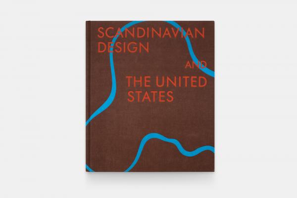
It was really difficult to design a cover for a catalogue that represents five countries, spans 90 years, and holds almost 200 works. We used the interior colors of blue, and the presence of warm browns and reds to compose it; the profile of the Aalto “Savoy” vase is so iconic as to be recognizable, but it doubles here as almost a landscape element. It's an abstraction but it works.
What is your favorite aspect of the book?
The blue type.
We love the blue type too! It feels very luxurious to read. Thank you, Lorraine and Ching, for sharing the design process, and for making a beautiful book.
Scandinavian Design and the United States, 1890–1980 is on view at LACMA through February 5, 2023, and will be on view at the Milwaukee Art Museum from March 24–July 23, 2023. The exhibition catalogue is available at the LACMA Store.