
As the exhibition Sam Francis and Japan: Emptiness Overflowing will soon be closing, I feel fortunate to have been able to spend some time recently in the galleries with the artist’s son Shingo Francis, an artist himself, to continue a discussion we had a few weeks ago via Zoom while Shingo was still at home in Japan. Our virtual conversation had focused on the wonder of color, primarily blue, and this follow-up conversation in person ricocheted among various topics of Shingo’s experience in becoming an artist and his reaction to seeing the works by his father and Japanese artists in the exhibition. What follows is a compilation of some observations and images touched upon in both conversations as we say goodbye to both this beautiful exhibition and to my colleague Leslie Jones, Curator, Prints and Drawings who—together with Hollis Goodall, Curator, Japanese Art at LACMA, and Richard Speer, independent scholar and curator—assembled such a remarkable group of works by Sam and others as one of her last projects here at LACMA.
, New York, photo © Museum Associates/LACMA")
What is it about this blue in its primal opacity that attracts our eye? I asked Shingo how he perceives color and how it influences his own art. As a starting off point, I wanted to share a quote from his father that I found in Saturated Blue: Writings from the Notebooks (1995), published by The Lapis Press, Santa Monica, to help guide the conversation:
"Saturated Blue is the mother liquid, matrix / Stars always appear when the blue is fully saturated"
Shingo noted that "blue, along with red, are both primal colors. Whereby red encompasses energy and passion, blue is regarded as universal and instinctual." Akin to a yin/yang or receptive/active dichotomy, blue is the color of rationality, while red is the color of emotions. Shingo added: "Both colors are often employed as a spatial element in art and they dominate in the paintings of the ‘color field’ artists," works by modern masters such as Mark Rothko, Barnett Newman, and Clyfford Still. Shingo's art can similarly highlight a color field expanse, cut across a monochromatic block of color with an intersecting line, or offset the background of a composition with a horizontal band of varying opaque and transparent colors. His application of color is dense and deep, layering distinct colors upon one another to create saturation and depth, which encourages the viewer to "look beyond the surface, pushing back at the idea of viewing art through a screen" (of preconceptions perhaps?) to become instead, as Shingo stated, "sensitized to engaging directly with the art itself."
, 2007; Infinite Space (scarlet-yellow) 2018; Open Space II, 2010; all works © Shingo Francis")
Whereas red traditionally represents fire and heat, blue often symbolizes the sky or the ocean, and a sense of coolness. We tend to think of the sky and sea as blue, but in reality, air and water contain no color; the blue that we perceive is produced through the reflection of light in the atmosphere and upon the liquid surface. Shingo noted that his concept of blue was likely forged from childhood memories that merged his American and Japanese identities. He drew reference to the land and seascapes of the Santa Monica beaches that he frequented during summers when he visited his father as a link to blue derived from the natural world, while the blue associated with Japan is likely more derived from the objects that surrounded him: the ceramic vessels and pottery shards that his grandfather collected, and the paintings in cobalt blue that his mother displayed at their home in Tokyo. Paradoxically, now as an adult, Shingo notes that the northerly atmosphere in Japan is cooler and actually “bluer” than that of California, where the southern sun and warmth predominate to offer a fuller spectrum.
, New York, photo © Museum Associates/LACMA")
In looking at Shingo's art, I realized that his compositions are usually less likely to have organic and free-form shapes such as the ones that appear in many of the works by his father. Instead, they display a predominantly monochromatic surface that is offset by intersecting straight lines or bands. Shingo's color field paintings exhibit a formal minimalism, but with a layering of media to create an expanse of color.
, 1961, Los Angeles County Museum of Art, Herman Weiner, M.D. and Lillian Apodaca Weiner, photo © Museum Associates/LACMA; Shingo Francis, Bound for Eternity (magentablue), 2009, © Shingo Francis")
Shingo has a memory of when he was young and traveled with his father in Europe, where Sam pointed out what he considered to be the paragon of perfect blue in a painting by Piero della Francesca. "You probably thought it would have been Giotto that he would have recognized, but it was Piero," said Shingo with a laugh. This comment made a deep impression on me, as Piero della Francesca is one of my favorite artists of all time. I never thought I'd find a link between any Italian Renaissance painter and Sam or Shingo Francis that I could write about! The subject matter, iconography, and sense of form and compositional arrangement between the works might arguably show an extremely tenuous connection in a study of art history. However, a similar understanding and crafting of pure color is the quest of all three artists, despite the more than five centuries between them, nevermind any cultural, geographical, or historical differences.
, New York, photo © Museum Associates/LACMA; Shingo Francis, Across the Threshold, 2022, © Shingo Francis")
In the 1950s, when Sam Francis lived in Paris, he painted abstract forms that suggest a more organic—almost floral—objectivity, as seen in the work above from LACMA's collection (not included in the current exhibition), which exhibits a tactile velvet-like appearance in its concentrated application of stunning lapis-hued blue watercolor. Shingo has also investigated a more multi-partite objective abstraction of form as of late, as seen in the 2022 series that was recently featured in an exhibition at Galerie Paris in Tokyo, Beyond the Threshold, layering the surface with red shapes upon an aquamarine background, the top and bottom edges of the composition washed in shades of violet, cobalt blue, green, and yellow. Similar to his father's earlier work, Shingo's layering of colors allows our eyes to visually "touch" the media on the surface, imagining the feel of something soft and luxurious. Shingo inserts a horizontal transecting orange line at the lower part of the composition, endowing the work with the hard-edged boundary. It is the predominance of the primary color that remains, however, paramount to our perception (blue in Sam’s work, red in Shingo’s work) and allows us to experience a truly sensate world.
, 1436, Groeningemuseum, Bruges, Belgium; Shingo Francis, Blue’s Silence (descent into purity), 2008, © Shingo Francis")
A segue in our conversation led back to a theme that merged Old Master painting with contemporary art. Shingo told me that his uncle once mentioned to him that his monochrome paintings reminded him of the indigo-dyed cloth that was produced by the company established by Shingo’s grandfather. This tradition of color, textiles, and painting in art history comes full circle when we look at an Old Master painting by a Northern Renaissance artist, which, through its handling of color, folds, and design, can replicate the tactility and sensation of velvet or brocade fabrics and costumes from hundreds of years ago, just as realistically as the spare blue compositions of Shingo's paintings can capture the essence of a simple bolt of indigo cloth.
In the gallery, Shingo and I spoke in greater detail about his own development as an artist, the obvious influences from the relationship with his father and being immersed in the world of art and artists in general as he grew up both with Sam in California and with his artist mother and her family in Japan. Shingo remembers his first forays in painting as a child with the buckets of liquid acrylic paint kept in buckets throughout Sam’s studio, where his father set up a corner of the space for his children to be creative, and how his creations were essentially copies of what he perceived his father was doing. As a teenager with a driver’s license, art-making became less of a siren, as Shingo just wanted to hang out with his friends, like any normal teenager. When he started college, Shingo first enrolled as a writing major, but soon returned to painting, obtaining his own paints rather than using his father’s, and he started to train in the rudimentaries of introductory drawing and painting classes: perspective, form, structure, lighting, shadow, anatomy, composition—and especially color. During his studies at Sonoma State University, Shingo studied under Walter Kuhlman, who told him, “You have a good sense of color—you are a ‘colorist’.” Shingo remembers asking himself then, “What does that even mean?” He continued, “It took a long time, just working through it and although I went my own way, I still have a lot of Sam in me. It wasn’t until I was in my late twenties that I finally began to feel comfortable. I worked for Ed Moses for a while. He nudged me. He said, ‘Who cares what people think? You’ve got this big load on your shoulder but you have to do what you want, who cares what people think?’” On a trip to France, Shingo also met up with the artist Joan Mitchell, who asked to see his work. Shingo recalls: “I rolled up all my paintings in a tube and carried it to her studio, outside of Paris. As I took out my paintings in classical perspective, copies of Old Masters, scenes of my own, Joan took a look at everything and stomped her foot and cried out, ‘Stop illustrating! You’re just illustrating, you’re not painting. But you do have a good sense of color.’ Joan then grabbed me and led me into her studio and said, ‘Look at these paintings. This is ME, you’re looking at my insides. Painting comes from within. Stay in here and don’t do anything but look.’ So then she locked me in the room for an hour and a half and I came to understand that she was right.”
, 2012; both works © Shingo Francis")
Sam Francis wrote: "The union of Red and Blue has a meaning that transcends our human understanding. This meaning is what I mean by the meaning of painting."
Shingo noted that by blending blue and red, the color purple/violet is produced, which is the final color in the Chakra, the Sanskrit word for “disk” or “wheel” that denotes the focal points of the human body in balance, all of which are designated by a specific color. The "Crown" Chakra is purple/violet, and it is associated with wisdom and spirituality, as well as with royalty, nobility, and the divine. Shingo's own explorations of blue and its layering with reds to produce these violet-hued tones are realized in his two series of paintings, Blue's Silence / Silent Light (2004–12) and Bands Dark Space (2010–14). Here, Shingo achieves the fully saturated blue that his father wrote about, the intensity of color culminating in a midnight darkness that inexplicably illuminates our field of vision.
, New York, photo © Museum Associates/LACMA by Alexander Schneider")
I asked Shingo to lead me to one of his favorite works by his father in the exhibition. I thought he would pick something rich in color erupting throughout the surface, laden with thick brushstrokes of vivid brilliance, containing elements that appear in Shingo’s own chromatic artworks. Surprisingly to me, he walked to the final gallery space, where the large untitled “edge” painting is installed. With its expanse of white that is offset by edges of bold and erratic colors, one’s initial reaction is that this is one of Sam’s least saturated works—the presence of intense color relegated to just the edges of the canvas, the expanse of the large white surface seemingly untouched in its starkness—and so different from how Shingo usually creates his own art. Shingo stated, “My style diverges from Sam here. [When I paint] I like to see the geometric in works, a monochrome surface, and color—I do feel like the white is part of Sam’s territory. I don’t really have a reason to go there right now.” Shingo’s emphasis is on the concept of ma—the space between, the void that isn’t really empty, which awaits the viewer’s reaction to understanding how space is filled with presence, and how, if you look closely, what appears to be white upon initial glance is really made up of a white that has tints of other colors in it. Shingo noted: “You can enter and have a contemplative experience as you live in the now, where space really starts to open and the earlier forms and colors have physically moved to the edge, gesture has been pushed to the side. Sam wanted the viewer to learn how to confront the void and although there may be less to work with visually, concurrently there is a widening of interpretation possible for each viewer. It is living in the moment, the concept of time and the present, that is important in works like this.”
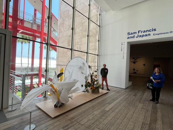
Sam Francis and Japan: Emptiness Overflowing is on view in BCAM, Level 2, through July 16, 2023.