
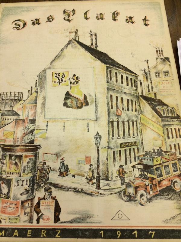
I was first introduced to the wonders of the German journal Das Plakat (The Poster) while working on Haunted Screens: German Cinema in the 1920s with Britt Salvesen in 2014. During research on the project, former Rifkind Center Librarian Erika Esau showed us cover illustrations of this groundbreaking publication that promoted European advertising and poster design during the first quarter of the 20th century, including an issue that provided an exclusive spotlight on film posters.

Discovering Das Plakat was akin to being a kid getting lost in a candy store—the format of copious colorful illustrations blended with typographically rich texts offered a visual feast—and Britt and I were thrilled to include two covers of the journal next to the original film posters that we borrowed for display in the exhibition.
Remembering the optical impact of Das Plakat, in tandem with its historical import in the dissemination of graphic design in the early 20th century, I wanted to include examples of the publication within the current rotation of 1917/1918: Looking Backward Stepping Forward. I realized that the variety of vibrant images included in Das Plakat, coupled with the diverse range of subjects explored, had offered their contemporary readers, weary with the trials and tribulations of those difficult years, a welcome escape through fabulous illustrations and stimulating points of view on topics that were usually a far cry from the miseries of war. However, at times, themes relating to war-related concerns also found resonance in a modern form of graphic display within these pages.

Despite the passing of a century since these publications were printed, the quality of their production and innovation in graphic design and typography remain as avant-garde and satisfying to our eyes today as they did to their original audience.

The history of how Das Plakat evolved, and the genius behind its birth, Hans Joseph Sachs, present an interesting narrative. In the early decades of the 1900s, Sachs was a successful dentist practicing in Berlin, where at one time, Albert Einstein counted as a patient. However, Sachs’s true passion was not focused on bicuspids and molars, but rather on posters, a newer graphic art form that found its most creative producers and avid champions in the Prussian capital at this time. Working professionally on dental issues from morning until mid-afternoon, Sachs shifted gears daily beginning at 3 pm, from whence he devoted himself into the night on inventorying his growing collection of posters. The bold and innovative designs, vibrant colors, and creative interplay of illustration and text formed a powerful mode of expression in advertising and found a welcome supporter and obsessive aficionado in Sachs, who rallied others to share in his enthusiasm for posters as a more accessible and affordable form of visual art that permeated all aspects of society.

In 1905, Sachs was one of the main founders of the Verein der Plakatfreunde (Society of Poster Friends), which would soon grow to include regional chapters throughout Germany, expanding far beyond the cosmopolitan hub of Berlin. Sachs is best remembered, however, for establishing Das Plakat in 1910. It was the first publication devoted to the poster as a medium for advertising in art. Published quarterly for the next 11 years, the lavishly illustrated journals were complemented by in-depth articles that provided analyses of posters and advertisements, and their creators, for both collectors and scholars of this modern form of visual communication in the graphic arts.
Fostering the international dissemination of German advertising art, Sachs was both publisher and editor for Das Plakat, which remained in publication until 1921. During the 11 years of its existence, Das Plakat featured illustrations and articles that showcased a wide array of topics, ranging from political propaganda and social concerns, to theatrical and fine art displays and literary associations, to technological and industrial advances and commercial advertisements that branded their products into the minds of consumers through sophisticated graphic design. It is unknown why the periodical ended its print run in 1921—perhaps due to conflicts between Sachs and other members of the editorial staff, or because of disagreements between some of the artists and collectors. Despite the relatively short life span of Das Plakat, however, its influence and import remain vital to an analysis of modern graphic design in Europe and beyond. Even after the demise of Das Plakat, Sachs continued to nurture his appetite for posters by supplementing his private collection, and by remaining an active proponent to further the reach and acclaim of this printed art form.
Although not comprehensive, the Rifkind Center is fortunate to hold most issues of Das Plakat dating from 1913 through 1921. For the purpose of focusing on only two specific years in the current Rifkind gallery installation of 1917/1918: Looking Backward, Stepping Forward, a variety of Das Plakat issues exhibits a rich panoply of illustrations and typography in posters created during these two tumultuous years.

Serious social and political concerns are graphically captured in advertisements, such as in the Czechoslovakian propaganda poster promoting the sixth war bond drive, with massive plum-purple rainclouds billowing as a backdrop for the ominous ebony eagle in flight; or as expressed with folkloric flourishes, grace, and elegance in posters issued by the Red Cross for women to donate their hair to make transmission belts, a necessity due to the lack of basic resources to supply the war effort.
, Los Angeles County Museum of Art, The Robert Gore Rifkind Center for German Expressionist Studies, gift of Robert Gore Rifkind")
One of these posters displays a simple comb with strands of long hair curling between its teeth—a rather poetic symbol of how a few strands of human hair can transform into vital components for a powerful mechanized industry.

In contrast to these more sober concepts, the periodicals from 1917 and 1918 also included scenes of entertainment and cultural pursuits: The bold yet simple design that delineates and forms color blocks to describe the face of German movie star Erich Kaiser-Titz, emerging from the shadows of a saturated black background in solid opaque swathes of green and yellow ink; the Jugendstil-like design and rich color palette of stylized women with a mask, the design itself masquerading as a theatrical advertisement for a literary association; and the plagiarized image of a leopard for a poster promoting Universal City in Los Angeles that is lifted directly from the original German design for a poster for the Munich Zoo.

It is especially entertaining to see an advertisement for Hollywood in a German publication from 1917! The text to this American version offers a humorous view of how early Hollywood was filled with extras actors costumed as “bugs and bugesses,” imploring its audience to “Come on out to Universal City and see all these maniacs earning their salaries.” How this was construed is only conjecture, but my guess is that it must have been considered as beyond ridiculous. It was truly kismet that this page spread in Das Plakat tallied with the strictures of keeping to the years of 1917 and 1918 for the current installation—living so close to Hollywood now and aware of the global impact of film today, it gave me pause to consider what a reader in 1917 would have imagined then, with no possible clue as to how this might resonate with people in Los Angeles one hundred years in the future.

Just for fun, and for a further immersion in the delights of the journal, I decided to take the earliest copy of Das Plakat in the Rifkind’s library (the issue dated March 1913), and devour it from cover to cover. I felt like Alice falling into the rabbit-hole. The main feature article and cover for this issue focuses on the work of Emil Preetorius, an admired graphic designer and stage set designer in Germany. My eye was drawn to the detailed illustrations drawn by Preetorius, each one manifested with wit, clarity, economy of line, and an insouciant flair for elegance. Looking at one illustration for an advertisement from 1911 for the German publishing company of Georg Müller, I honed in closer to each part of the picture, placed above the cursive text that simply yet gracefully announces its subject: “Georg Müller Verlag, Anno Domini 1911” (Georg Mueller Publishers, AD 1911). The artist placed a horse-drawn carriage at the center of the composition, with the delicately scripted initials of the publisher “GM” visible on the side of the vehicle. Birds are perched upon the carriage and fly in the sky above; and a dog, seemingly a pointer, stands sentry on the right, looking out beyond the picture plane. High in the sky two hot air balloons waft through the air, one inscribed with the initials of the publisher, and both inscribed in small scale with the year “1912,” a year following the more grounded reference to the text area where “1911” is prominent. Does this advertisement thus symbolize a prognosis for business success in in the year to come?
Leafing through copies of Das Plakat in the Rifkind’s holdings is a pursuit that I hope to enjoy as the years continue, allowing the past to come alive today, and imagining stories along the way.
1917/1918: Looking Backward, Stepping Forward is on view in the Ahmanson Building, Level 2, through April 1, 2018.