“3D” (or “3-D”) is one of the most ubiquitous, versatile, and graphic abbreviations around. The shortened form, for three-dimensional, celebrates the breakthroughs of science, technology, and mathematics, but it also parties with pop culture. Whether read subtly in plain text or exaggerated through marketing, the juxtaposition of the number three preceding a capitalized D implies that there is in fact “more to see.” The visual expectation of this abbreviation, to leave an audience or reader wonderstruck, is a typographic obstacle. Moreover, the styling of 3D often clings to visual tricks employed by decades old B-rated movie posters or slick, quickly-outdated interpretations of what the “future” may look like. Between the preconception and the speculative it’s hard to pinpoint what the characters are actually supposed to look like. There is no doubt that 3D is an extremely rich topic for visual exploration, and it was the desire for the exhibition catalogue, 3D: Double Vision, to avoid routine solutions and find its own visual voice.
The term “look and feel” is used to describe all facets within a design including items like typefaces, colors, shapes, patterns, layouts, as well as any other element which can make the overall design distinct. Early 3D movie posters, starting with the 1952 Bwana Devil, share many similarities with 1950s American advertising; both were filled with illustration-based imagery and radiated plenty of bright and pastel colors. However, the unique charm to these low-budget commercial movies reside in their combination of typography and imagery, glossy slogans, and how they attempted to visually explain the experience of watching a film set in the third dimension. Bwana Devil’s poster featured a bold foreshortened title leaping from the audience (who are actually depicted on the poster) and typographic messages boasted “A LION in your lap!” and “A LOVER in your arms!” If the multi-message assault wasn’t enough to convey dimension, additional illustrations blatantly replicated a lunging lion and a figure extending their arms out of shapes which could only be reminiscent of the movie screen itself. As the novelty of these new films spread, the repertoire of graphic language and visual devices repeatedly “came right at you.” Extreme perspectives, the competing directions of forms, monumental volumized lettering, and even depicting the actual anaglyph glasses persisted from the 1950s to ’80s (Jaws 3-D being one of my favorites!). Though these unconventional typographic tropes offered a “new kind of excitement,” they volunteered a lesson of what not to do as we aspired to communicate the perfect “3” and “D.”
Somewhere between loosely sketching letterforms for 3D: Double Vision and constantly unearthing obscure ephemera for reference, it dawned on me that a specific typeface for 3D was/would be paramount. This publication was to survey more than 175 years of experimentation and innovation in art and culture ranging from small 19th-century photographs to video-immersed rooms, and we needed something which could be bold in spirit without disrupting the astonishment of the works. Mind mapping and thinking through different possibilities led me to one of my favorite design books, the 1974 Compendium for Literates: A System of Writing by the prominent Swiss designer Karl Gerstner (1930–2017). Gestner, renowned for his authorship on design as much as for his typography, professional practice, and art, strove for a systematic approach in solving problems over making instinctual formal choices. Los Angeles-based designer and educator Michael Worthington described it best in his Eye Magazine Autumn 2003 love letter to Compendium for Literates: A System of Writing: “At 15 × 15 cm, the book seems too small to be a compendium of anything, but this unassuming, immaculately crafted black, white and grey gem is indeed a dense little brick of knowledge—a treasure-chest for contemporary designers.” (You can read an excerpt of that article). Compendium offered an ideal structure of looking and evaluating a wealth of typographic possibilities for preparing to design 3D: Double Vision. It’s meticulously ordered inventory revealed how to spare no detail too small when examining all possible characteristics of the 3 and the D. We organized our studies in an entirely new process book which arranges the examples methodically into categories of Type, Form, Sace, Supporting elements, Fill and initial reference imagery.
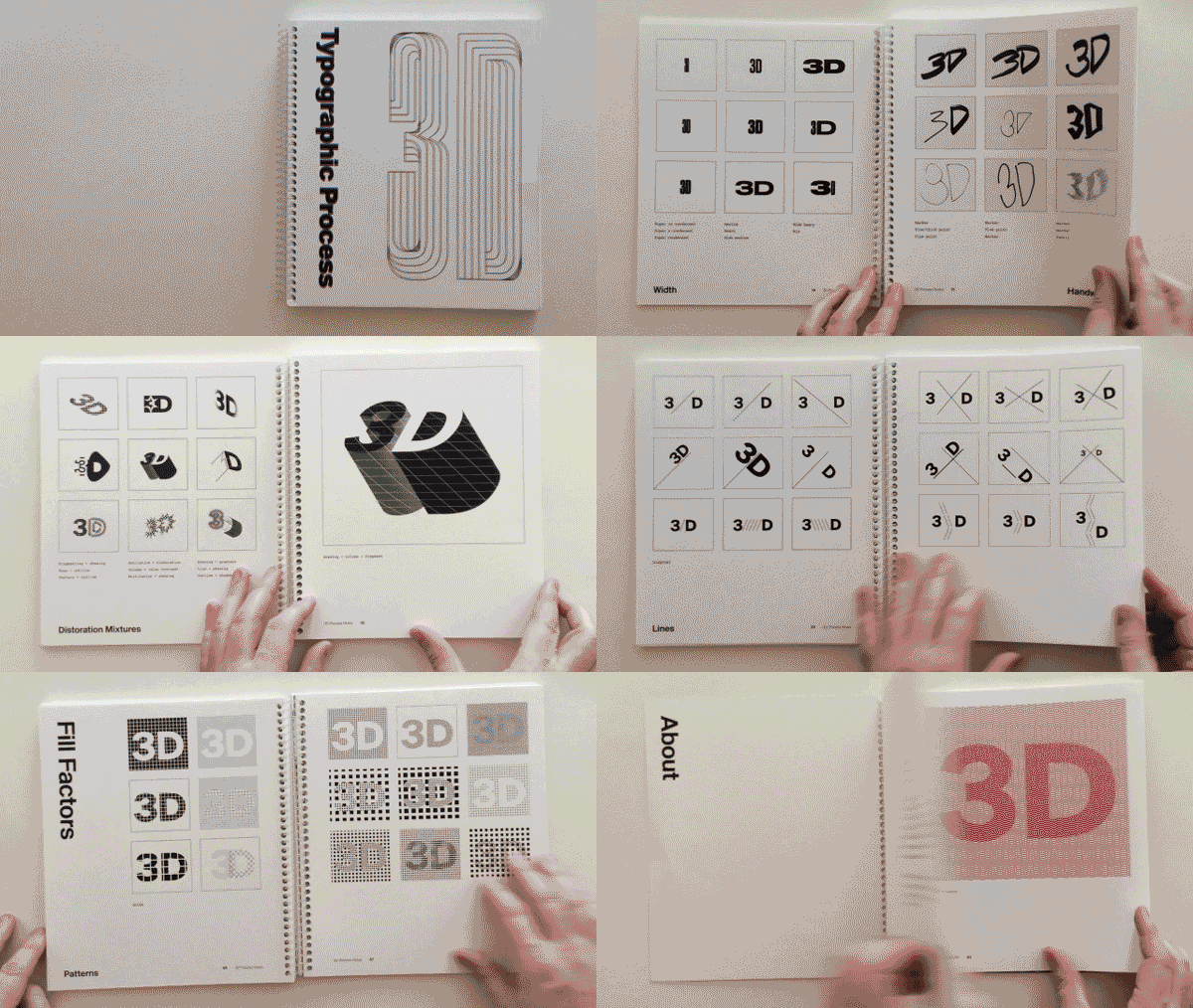


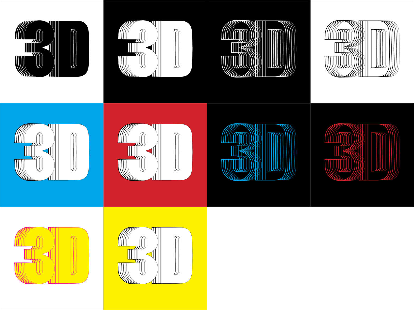
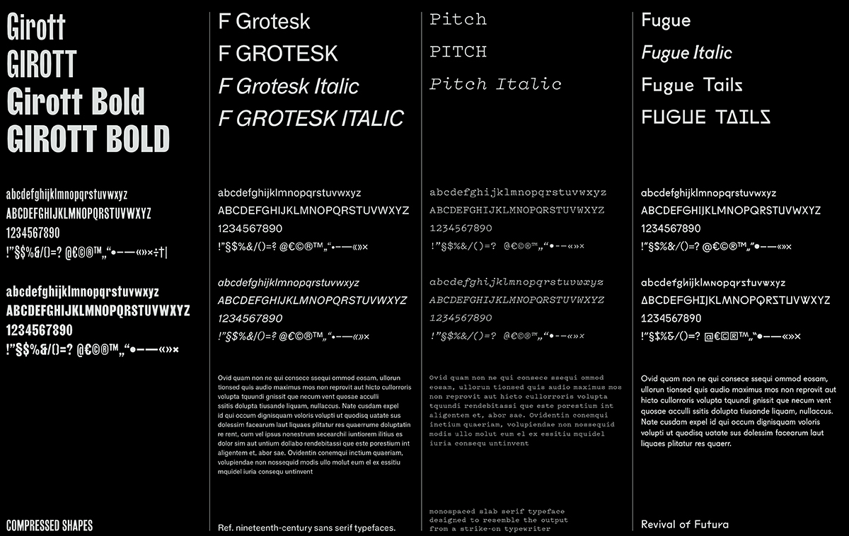
Investing the time to scrutinize all formal decisions led to a number of unforeseen conclusions. First and foremost we found that making the “3D” as visual as possible made sense when the type could act as a hero and didn’t compete with artwork. The popular treatment of volumizing or making the characters feel dimensional starting back in the 1950s made sense, but it had to develop to avoid those B-rate clichés. Most importantly, a loose typographic methodology was developed to coordinate with how mainstream culture and traditional art history’s interest “boomed” across time. A bold condensed poster type stood in for the 19th century, an early sans serif represented the beginning of the 20th century, a typewriter font was selected as the mid 20th century (as a nod to early computing) and a typeface where symbols and letters could be interchanged was thought of as the present. Regardless of how the palette of typography was refined over the course of developing the publication, its process was exponentially intriguing.
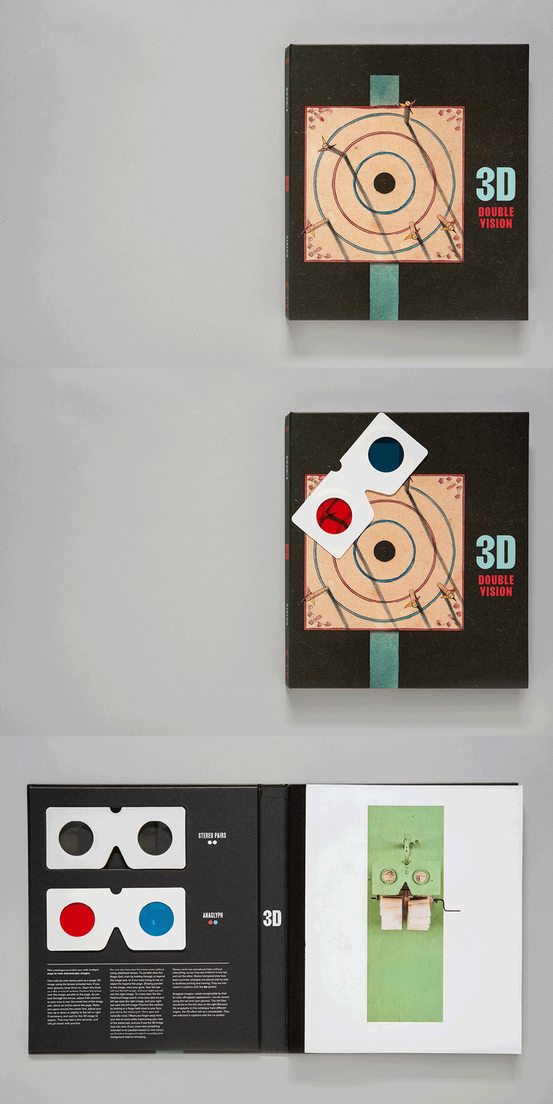
Stop by the exhibition one last time before it closes Monday, April 1, and pick up your own copy of the exhibition catalogue!

