
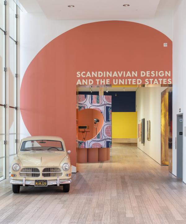
Scandinavian Design and the United States, 1890–1980 examines the many modes of design exchange between the U.S. and the five Nordic countries of Denmark, Finland, Iceland, Norway, and Sweden over nearly a century. Visitors to the exhibition cannot miss the bold exhibition design by the firm Bestor Architecture. I invited Barbara Bestor and her team to design the exhibition because I admire how her interiors combine a deep knowledge of the history of design with a contemporary sensibility, and her personal connections to the objects in the show, as she describes below. The team included lead designer Henry Cheung, as well as Brad Silling and Andrea Dietz. I sat down with Barbara to ask her how she conceived and envisioned the design for this large and complex exhibition (now on view at LACMA through February 5, 2023).

Tell me about your design process. After receiving the exhibition checklist, how did you begin to visually conceive the exhibition?
The checklist was daunting, because there were so many amazing objects! Prompted by the images and objects we received, we based our organizing concept on the design of world’s fairs and international traveling exhibitions where Scandinavian design was introduced and promoted to the general public. Having been to different furniture trade shows and art fairs, we found a certain competitiveness from exhibit to exhibit—each booth is trying to make the biggest impact. It can be overwhelming, but some of the immersive techniques are very useful in a show like this, where we’re trying to unify objects of different scales and materials. Personally, I grew up in Cambridge, Massachusetts, where the Design Research shop sold the first textiles and clothing by the Finnish brand Marimekko. It was very influential for me, engendering a love of supergraphics, pattern, bright colors, and natural wood. Learning about the immigrant Finnish couple Eliel and Loja Saarinen and their work at the Cranbrook Academy of Art in Bloomfield Hills, Michigan, and visiting Hvitträsk, their summer home outside Helsinki, a few years ago broke open a whole new set of ideas that we’ve been exploring at my office in terms of patterns, textiles, and integration of architecture and interiors. I hope that the visitor’s experience walking through the exhibition is immersive, and draws people to spend more time looking at and learning about the objects and their stories.

How did you connect the objects in the exhibition with the design elements of the installation?
We used the technique of supersizing some of the objects to become framing devices for the exhibition. For instance, we made the Swedish-American architect and designer Greta Magnusson Grossman the focal point of the entrance. Her sculptural asymmetrical lampshades became both the big window into our Greta Grossman “office,” as well as the shape of the platform for chairs in the Migration and Heritage section, which focuses on the contributions that immigrants make to their adopted societies. Also, the mauve-like pink color of her 1940s lamps became the defining color for that section.

We took the classic Alvar Aalto “Savoy” vase and used its flower-like footprint as the platform for a group of chairs in the Design for Diplomacy section.

In the Teachers and Students section, we used blue zigzags from Eliel and Loja Saarinen’s “Cranbrook Map” tapestry as the shape of a platform for furniture by Cranbrook graduates, and also as a color cue for the vitrines.

The very graphic menu from the Scandia restaurant, a legendary Danish eatery once located on Sunset Boulevard, featured the bright red and white striped sails of a Viking ship, and these became a supergraphic on the wall of the Selling the Scandinavian Dream section about the marketing of Nordic goods to American consumers. We imagined that the platform was a giant Viking ship of imports sailing to the U.S. The black-and-white Marimekko fabrics suspended from the ceiling suggest sails and are inspired by a classic image of the Design Research shop in Cambridge, Massachusetts, with black-and-white fabrics billowing from the windows.

Can you tell me about the major elements of the exhibition design—their inspiration and how they function?
The major elements we used in the design are fields of vivid color, birch wall panels and columns, and painted sonotubes (extremely sturdy cardboard tubes typically used as a construction material to pour concrete columns). Scandinavia is still associated with wood exports and sustainability, and I thought it would be great to have actual tree-like peeler logs to bring natural elements into the show. As a huge fan of Finnish architect Alvar Aalto, I was inspired by his Villa Mairea, with its bundles of posts organizing space, and his Finland Pavilion from the 1939 New York World’s Fair, with its undulating wood walls.

The sonotubes are an homage to Deborah Sussman, the designer of the colorful, temporary architecture for the 1984 Los Angeles Olympics, whose exuberant colors and temporal architecture epitomized the postmodernism of her generation. We often use fields of color on floors and walls because they create an immersive atmosphere with very little cost or material. Atmospheric, immersive design has become really important when budgets do not allow for elaborate materials or craftsmanship.
Did any of the objects surprise you? Why?
I was surprised by the work and students coming out of Cranbrook Academy of Art in Michigan. I knew about it intellectually, but as an East Coaster who became a West Coaster, I hadn’t realized how much design production and innovation occurred in the Midwest after World War II. Loja and Eliel Saarinen have become some of my favorite designers recently, especially their “Cranbrook Map.” Saarinen designed the campus and invited many of the faculty from Sweden and Finland, and many of the most famous mid-century designers studied there, like Charles Eames, Ray Eames, Eero Saarinen, and Florence Knoll.
What were the challenges that this exhibition presented? How did you solve them?
The greatest challenge was creating visually exciting stories and settings given the massive quantity of objects! It was a fun challenge! While the curators grouped the objects for us by theme, we had to arrange the groups into compelling displays. Using a maximalist design strategy helped us tell so many rich stories that wouldn’t have been possible in a traditional white box approach.
What is your favorite aspect of the exhibition?
I love the Viking ship of commerce. I definitely went all in accessing my 1970s childhood memories: my room with bright yellow Marimekko fabrics and tons of toys. It also made my mom very happy because as a German immigrant from the 1960s, she felt right at home.