
Typography is a potent ingredient for preparing an exhibition's look and feel, and composing a title wall with type alone can be one tall order. Since title signage performs double duty of both identifying and directing the visitor and visually introducing something one is about to see, it can be challenging to attentively balance function with an appropriate appearance. More often than not, the functional component is interdependent on its surrounding architectural environment. The visual pursuit is frequently a blend of imagination, collaboration, and historical fact-finding in search of a compelling communication.
For Robert Mapplethorpe: The Perfect Medium, there was a persistent meaningful typographic investigation. Typesetting the name "Robert Mapplethorpe" can be discouraging. Aside from the disproportionate amount of letters in the first and last names and the double “p”, there are 30-plus years of exhibitions, books, and invitations, all attempting to synthesize his work and aura into 18 characters. For an artist like Mapplethorpe, it's not uncommon to think or hear the observation, "that doesn't look like Mapplethorpe," revealing the conscious or subconscious attributes a particular typeface may possess doesn’t express the true essence of the work.

To avoid being stuck conceptually, designers return to the original content and look for deferred meanings, unfamiliar connections, hidden narratives, or alternative interpretations. I remember repeatedly flipping through the lengthy exhibition checklist and gravitating to the ephemera, the saturated color flowers, and the album covers. While the early Mapplethorpe invitations seemed too predictable as a creative springboard, the combination of album covers and flower-based work conjured the album art of New Order's 1987 Substance.
, Double LP, 1987, design by Peter Saville Associates")
Substance, or “Fact 200” for Factory Records aficionados, was designed in 1987 by Peter Saville Associates and featured an atypical mixture of neoclassical typography and vibrant organic forms. Saville, along with photographer Trevor Key, used an invented photographic process, coined the dichromat technique, to generate the album's color-manipulated coral branch and opening peony imagery. The somewhat mysterious method has been described by Saville as "a process like silk-screening but using a color enlarger and allowing light to pass through it instead of ink, and using masks and layers exactly the same way as silk-screening." The album's vivid visuals and elegant title, typeset in Bodoni Titling, inspired the balance of referencing classical form and overall attitude for The Perfect Medium title wall.
Saville's typographic choice prompted further editorial strategies in how to present the show's introduction and wall text. The Bodoni typeface was designed by Giambattista Bodoni (1740–1813) in the late 18th century and is well-known for it's thick vertical strokes, contrasted with abrupt, thin, unbracketed serifs. It's regularly celebrated along with Didot, a French Didone high modern serif, as typographic blue blood, emblematic of fashion and luxury products. Publications like Vogue and Harper's Bazaar have, throughout their history, employed high modern serifs for mastheads, bold headlines, and drop caps (large capital letters at the beginning of a text block). A 2007 Eye Magazine feature on fashion and typography suggested that "Didone fonts create an x-ray of the word. Their anorexic, skeletal forms create an ideal overlay for photography."
, January 1, 1950, photo: Erwin Blumenfield, art direction: Alexander Liberman")
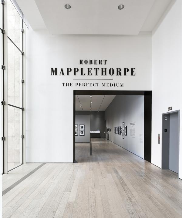
As exhibition planning progressed, we outlined a purposeful typographic strategy rooted in polished editorial design while remaining sympathetic to Mapplethorpe's bold, stylized work. We envisioned the gallery walls as physical magazine spreads. Large section titles could simulate bold headlines, providing visitors the freedom to explore the gallery, but offering guideposts when they wandered into a different section of the exhibition. Supporting elements like horizontal rule lines, also inspired from Saville's LP cover, provided a supporting detail to reinforce the hierarchy of information within the wall text. Given the visible contrasts within the letterforms, Bodoni is not dependably readable as smaller text in a physical space. For this reason, we complemented the formal serif with a warmer, geometric sans serif font, which allows for maximum contrast between titles and texts (to enhance legibility of smaller things like labels). Aside from necessary legibility, typography has a tremendous ability to help structure the pace and space of an exhibition. It’s a designer’s responsibility to leverage the type’s idiosyncratic nuances and their associations to enhance the artwork on display.

One of the last, but most important, steps in planning exhibition graphics is deciding on how they will be fabricated. What might work on screen or in print doesn't necessarily translate seamlessly into actual space. By meticulously sampling various materials and colors, and generating full-scale mock-ups (with the curators) in actual gallery lighting, the intention is to understand and agree on the precise details of the elements being produced. One of the most substantial challenges was executing the title wall lettering to match Mapplethorpe's provocative perfection. Slick glossy black acrylic emerged as the ideal substrate to mimic the black velvety richness of the printing in many of the photos. The all capitalized title, set in Bodoni, put together with the consummate color and materials provided the ideal tone to announce this presentation.

From the Bodoni titling to the editorial considerations to the materials and colors, the graphics in Robert Mapplethorpe: The Perfect Medium highlight the artist's drive to perfection. And just like many of the stunning photographs of the show, some typefaces never go out of style.
Visit Robert Mapplethorpe: The Perfect Medium at LACMA through July 31, 2016.