Since it opened late July, Guillermo del Toro: At Home with Monsters has been drawing record numbers of visitors, and it isn’t hard to see why. Showcasing a varied range of sculptures, paintings, drawings, and costumes from both the filmmaker’s and LACMA’s collections, this captivating exhibition takes a new approach to the cobwebbed corners of the human mind. Not only does At Home with Monsters put del Toro’s films in conversation with the historical masters of the strange and fantastical—works by Francisco Goya, William Blake, and the imaginary prisons of Giovanni Piranesi become newly familiar—but the exhibition also challenges the unconscious strategies we use each day to evaluate and classify artworks as “elite” or “popular,” “high” or “low.” Could the ornate illuminated manuscript displayed between books of gothic fairy tales really be a late medieval Book of Hours? Or is it instead a movie prop from Hellboy II?
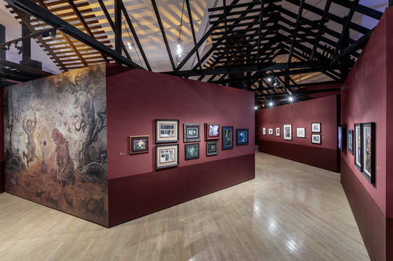
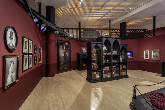
Yet as thought provoking as these objects are, it’s the unique setting in which visitors experience them that makes the exhibition so memorable. Wandering through labyrinthine corridors lined with gothic-style cabinets and bookcases, it’s easy to feel like a voyeur in a stranger’s home. Santi, the ghostly orphan from The Devil’s Backbone, stands behind a pair of heavy black curtains, radiating in coils of pale blue light. Frankenstein and his bride exchange a tender moment behind rafters exposed by a hole in the gallery wall. Given the coffin-shaped corridor and the blood-colored walls, the angular shadows and the rain-filled windows, visiting At Home with Monsters feels a little bit like exploring the derelict house of an eccentric antiquary, or a late Victorian dreamscape on LSD.
I sat down with Martin Sztyk, LACMA’s exhibition designer, to learn more about his creative process.
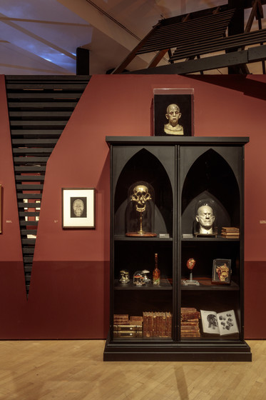
When I visited the exhibition for the first time, the first thing that came to mind was the “cabinet of curiosities,” the encyclopedic collections of objects and artworks so common in early modern Europe. Where did you find inspiration for this kind of model?
That’s exactly what we were going for. The first site we looked to was Bleak House, the real, private home in Calabasas where Guillermo keeps his collection and writes his films. On the outside it looks like any other suburban house in the neighborhood; it’s pretty unassuming. Inside, it’s completely stuffed with objects and artworks from wall to wall. Sometimes it’s difficult to move.
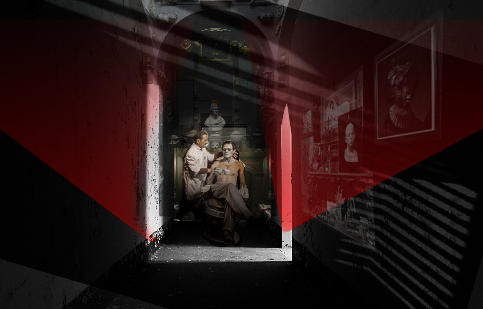
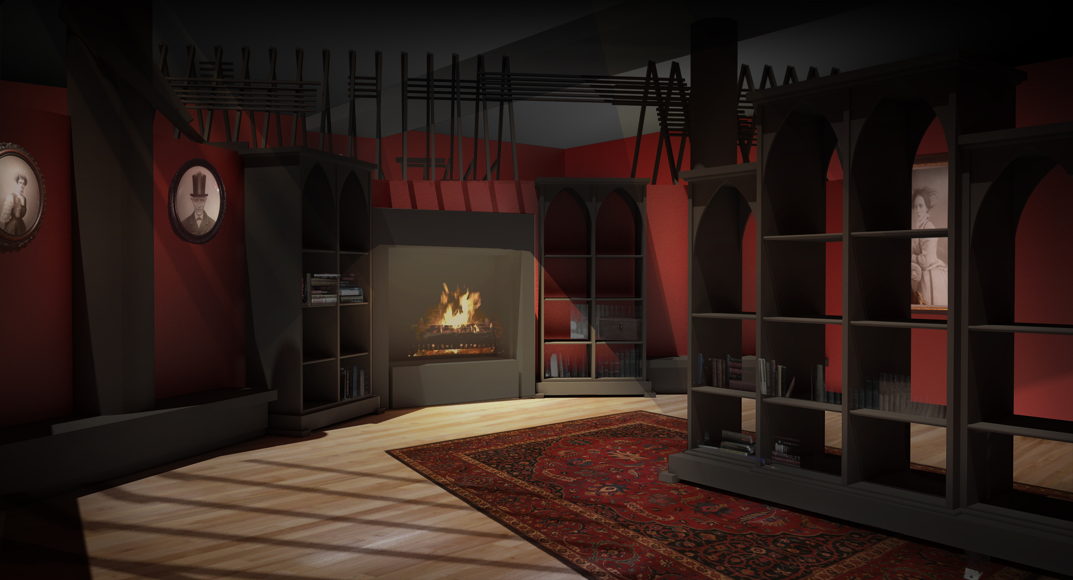
Today, these kinds of spaces aren’t nearly as common, but there are still a handful of museums that have this same sort of feel.One of my biggest inspirations was Sir John Soane’s Museum in London. Soane, a 19th-century architect, spent yearscollecting paintings, drawings, models, and all kinds of antiquities from Egypt, Greece, and Rome, packing them into a house that is now a living museum. It’s incredible. Then, once I started looking at Guillermo’s work more closely—not only his own films but also the films that inspire him—I decided I wanted to give the concept a “horror noir” approach. Deconstructed Victorian architecture. Exposed rafters that cast hard shadows on the ceiling and throughout the space. I wanted it to feel like a burnt out haunted house, but without feeling kitschy.
Where do you begin when you begin to design an exhibition?
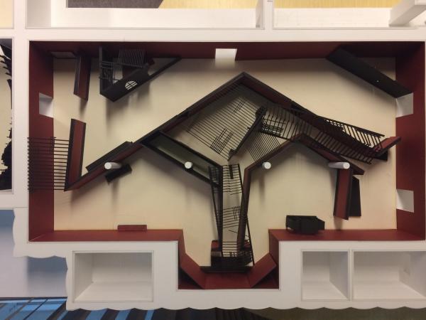
Once we had a few ideas floating around, the initial step of the design process is drawing sketches of the concept. I did a few quick 2D sketches of the interior, essentially mood drawings used to set the narrative. These were based off of a few precedent images I found in Guillermo’s films, some Vincent Price films, as well as past exhibitions we’ve done in this space here at LACMA. Based on these sketches, [curator Britt Salvesen, assistant director of exhibition design and production Victoria Behner, and I] came up with a few different floor plans to show Guillermo. One was more gridded and straightforward, another was more labyrinthine, and a third had a bunch of asymmetrical corridors, very Victorian in its footprint. It was this third one that Guillermo gravitated toward.
Once we had agreed on a 2D floor plan, we started building the concept model. It’s made out of paper and foam core, and it is about 3 x 4 feet. It was rudimentary, of course, but the bones of the exhibition were there. The model really helped us understand how visitors will move through the space.
From the indoor storm clouds to the rainy windows to the ominous soundtrack, the special effects take on lives of their own in this exhibition. Where do they fit in the design process?
Recreating Guillermo’s “Rain Room”—complete with storm cloud projection and rainy windows—was actually Guillermo’s idea! He was fascinated by the Haunted House at Disneyland, so much so that he actually installed a rainy window in Bleak House in order to recreate the atmosphere in his workspace. So we decided on the storm cloud pretty early in the process, but we needed to figure out the logistics. How should we do it? And where we should we put it?
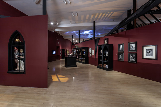
As a team, we ended up reaching some creative solutions.To create the stormy projection displayed on the gallery ceiling, Patrick Heilman [LACMA’s gallery media manager] started in his backyard! He fixed his iPhone on a tripod facing the sky and filmed it for eight hours. Once we had the video, we went in and altered the color and the saturation to give it a darker, more ominous mood.
The exhibition’s soundscape was the finishing touch. Guillermo had his collaborators come in and compose a soundtrack for the gallery. All in all, it was a really great collaborative effort, both inside the museum and out. It was amazing to have so much participation from so many people, especially given Guillermo’s incredibly busy schedule. He was always happy to hang out and throw ideas back and forth.
What were the biggest challenges of translating a small private collection into big public exhibition setting?
The biggest challenge for us was ensuring that the gallery retained that domestic feel: taking the concept of these narrow hallways and secret openings and putting them into a space that can hold 300 people at the same time. Traffic, bottle-necks, and circulation suddenly became big issues.
Solving these issues always comes down to compromise. This exhibition can never be as intimate as a private home, or quite as claustrophobic. We ended up enlarging the front corridor of the show, because it’s the place where people tend to congregate and get their bearings when they enter the exhibition. Ideally I would have liked the lighting to be even darker and more dramatic in order to give the experience a more disorienting feel, but that would have been harder for the visitors to see the objects on display.
Your background is in architecture. How does that influence your approach to exhibition design?
For me, the biggest difference between architecture and exhibition design is the speed of the turnaround. Residential or commercial projects can take years to complete, but exhibitions move quickly from concept to drawing to becoming a real thing. It’s amazing because it provides this sense of immediate gratification. Of course, the pace is pretty demanding too. There’s a lot of reshuffling and resubmitting and getting approval. There’s always a back and forth.
Guillermo del Toro: At Home with Monsters is on view through November 27, 2016. In the mood for more Guillermo del Toro? Check out a series of films by Guillermo del Toro that are featured in the exhibition. Or come to Fuel for Nightmares, a curated series of the filmmaker’s inspirations, influences, and favorite films that takes place every Tuesday at 1 pm through the end of October.


