
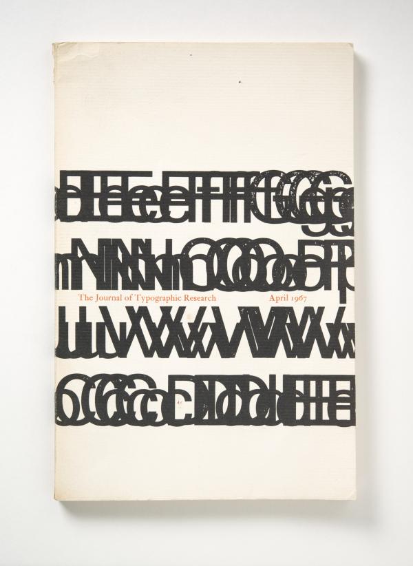
Typography is at the heart of visual communication. The selection, organization, and placement of letterforms in a work of graphic design profoundly impacts how a viewer interprets the text.
.jpg "Massimo Vignelli, Knoll International, 1967, made for Knoll International, Los Angeles County Museum of Art, gift of Peter and Shannon Loughrey, © Estate of Lella and Massimo Vignelli, photo © Museum Associates/LACMA")
The works on view in the exhibition Between the Lines: Typography in LACMA’s Collection span over a half century, from the 1950s through 2013. During this time, designers wrestled with how to use letter spacing and form to underscore the meaning of their texts, or to capture the mood of their time. Some practitioners, such as Massimo Vignelli, extolled clarity as the ultimate standard of success while others jettisoned legibility in order to convey abstract ideas and sensory experiences.

Innovative designers challenged the limitations of available technologies, from letterpress to photo typesetting to computer software. Corita Kent physically bent and folded her texts, then photographed them to create stencils for her serigraphs. Her distorted letterforms encourage deeper readings of banel slogans, such as the Coca-Cola jingle in this print.

Takenobu Igarashi created the futuristic blurred effect on this poster by painstakingly moving the words “New Music Media” over photosensitive paper in three-millimeter increments.

Others arranged words into dense clusters or precise curves, allowing the spatial relationships between them to suggest multiple layers of meaning. And some expressed themselves through historic and vernacular forms, drawing connections with the past or finding new meanings in familiar tropes. In the catalogue covers for her rare book business, Ex Libris, Elaine Lustig Cohen integrated hallmarks of each modernist movements’ expressive typography while maintaining a clean, contemporary aesthetic.
The works on view capture a wide range of typographic approaches, from brash headlines to delicate hand-scrawled text. Together, they demonstrate how inventive typography can enhance a work of design, adding layers of meaning beyond the simple words on the page.
Between the Lines is on view in the Ahmanson Building, Level 2.